Brilliant Branding Moment: A Perfect Christmas Interpretation in Beverly Hills!

As is our habit, we always take a look at some of our favorite brands window dressing,  when we are in Beverly Hills in the wee hours of the morning.  We were both  drawn to this creative branded tree!  What a clever way to keep Christmas secular and commercial at the same time!

Louis Vuitton was found in 1854 in Paris by its namesake.  It's LV monogram appears on  most of its products ranging from suitcases, leather goods, jewelry, clothing, shoes, etc.  Louis Vuitton is one of the leading fashion international fashion houses.   This monogram is a sign of prestige and luxury for many consumers world wide, who wear those initials with great pride.  

Branding Moment: The 16 Billion Dollar Color Package Sale!

We have always insisted when developing a brand for a luxury real estate marketing profession or a  luxury company being consistently remarkable should be reflected in all the presentation materials. Whether in print or on the web, one has to stand out and communicate their identity and its congruency with the target market.

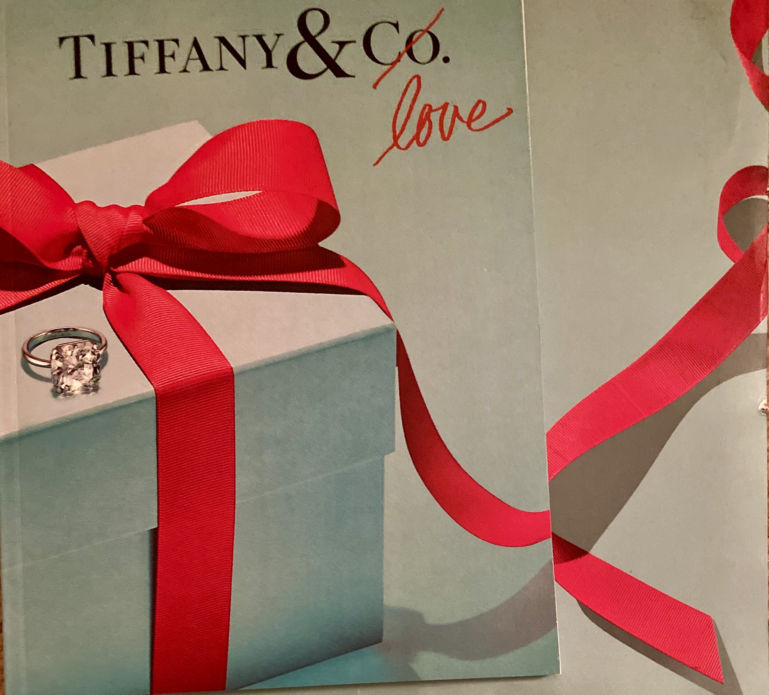
In our numerous posts on the subject, we have often analyzed the Tiffany Brand.  In our live presentations, we often brought a Tiffany jewelry box with white ribbon, and another brand's jewelry box.  When asking participants which one they preferred Tiffany won the majority every time.  

The quintessential American jewelry brand was recently acquired by LVMH (Louis Vuitton, Moet Hennesey) for the sum of $16.2 billion.  Here is more of the story from Reuters:

The Reuters article stated the due diligence that LVMH did on the subject of color,

Bernard Arnault spent lots of time checking all the IPs and protections on the blue box. The most famous Tiffany product is actually its packaging, the color, the form, the white satin ribbon, all of this is protected,” said one of the sources close to LVMH.  LVMH's billionaire boss, 70 year old Bernard Arnault stated in an interview with Reuters: "We're the owner of a color, it's a pretty rare thing!"

Next time you entertain the thought of that a vanilla presentation or a vanilla website is good enough, think again.  It may cost you the listing!  The same exact diamond ring signed Tiffany will cost more in a Tiffany box and will be treasured even more, than the one in the plainer branded box!

Would someone buy your package?

Happy Thanksgiving: May You Touch Heaven!!!

Pictured above is a Thanksgiving vignette that was created by one of the farmers at the Santa Barbara Farmers Market last Saturday.  Wishing you all a wonderfully delightful Thanksgiving!

To speak gratitude is courteous and pleasant, to enact gratitude is generous and noble, but to live gratitude is to touch Heaven.

Johannes A. Gaertner--Author

Cheers!  Ron & Alexandra

Branding Moment: Finding Your Business DNA!

Pictured above is a portion of a cave that was enclosed in glass to show the dirt/soil that the grapes of this winery grow in this particular Napa Valley floor!  The term for the DNA of the soil is "terroir". Terroirs in the same acre of land can differ from one side to another.  

As glaciers melted, oceans receded, and climates changed, the soil was also affected . By studying the composition of the soil, one can predict with some accuracy what grapes will do best, as well as the taste of the wine.  For instance, the Constant Winery grapes are grown on volcanic soil, and we could taste a hint of smoke in the 2011 wine, and not in another vintage grown in a different area.

The same is true for humans.  Although siblings may inherit similarities in DNA, they will still have their own unique characteristic that identifies them. The entire exercise of personal branding for real estate agents is geared to cracking your DNA Code. That is, clearly and succinctly articulating your unique selling proposition—how you are different, not alike (not like your competition).

DNA profiling or genetic fingerprinting is a technique employed by forensic scientists to assist in the identification of individuals on the basis of their DNA profile. Although 99.9% of human DNA sequences are the same in every person, enough of the DNA is different to distinguish one individual from another

In real estate agent personal and company branding we identify your 0.1% difference. Then we amplify it graphically, in messaging and in distinct marketing strategies that set you apart from your competition, in a nano-second, in the minds of your target market. 

The faster you can tell your target market how you are different, not alike, distinct from other agents, the faster they can decide to work with you or not. People like to do business with people like themselves. The faster you let them know you are like them the faster you can build trust in your business relationship.

What’s at stake in cracking the genetic code through the process of personal branding for real estate agents and real estate companies? Whoever has garnered the most high trust relationships wins.

Here is a basic way to get started in cracking your own DNA code:

1. Look at how your competition attempts to differentiate themselves from one another.

2. Check out their websites and see how well they distinguish themselves.

3. Ask yourself how you are different from them?  (different does not necessarily mean better, it means unique, inimitable--because you cannot imitate a DNA code).

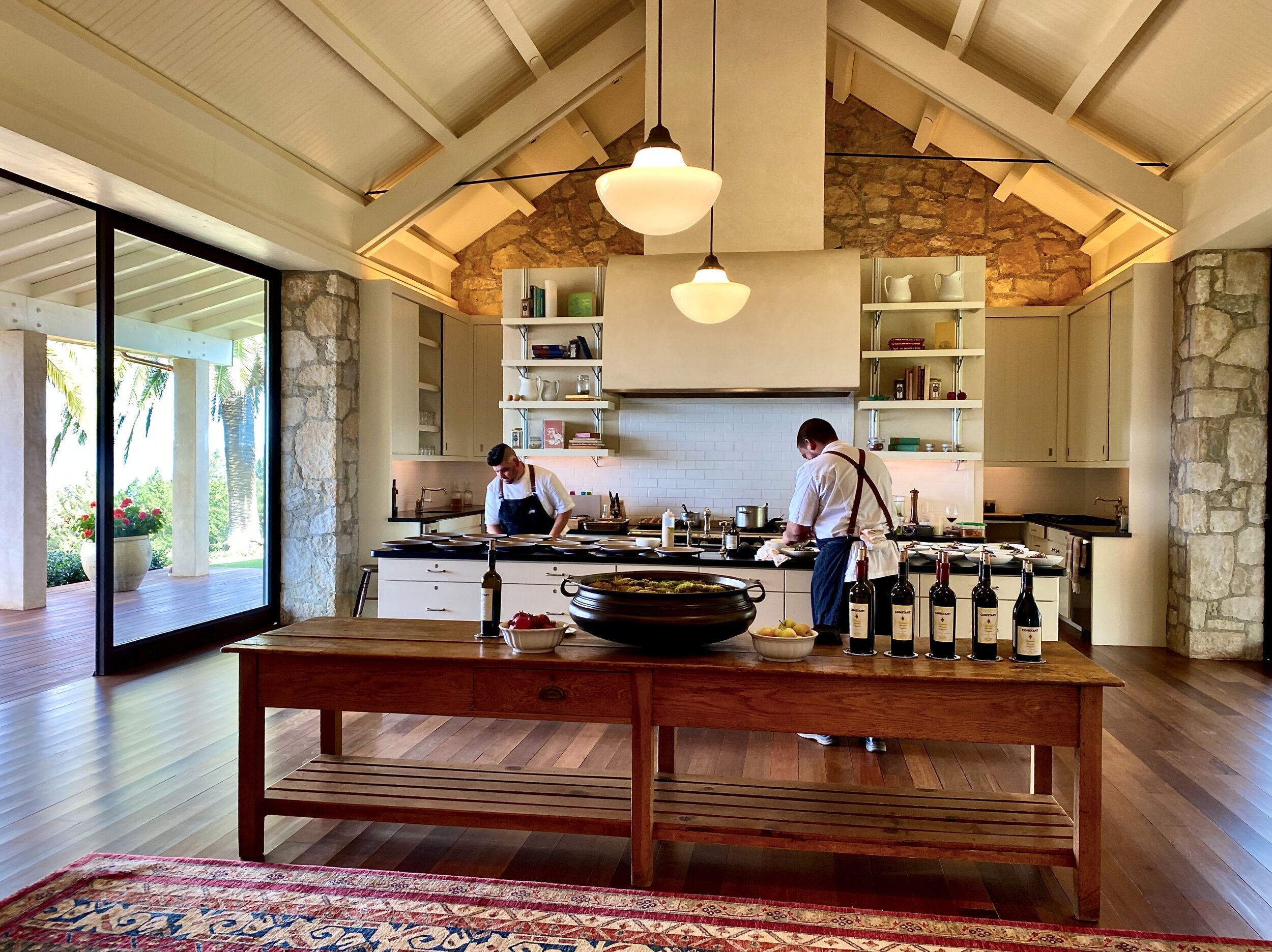
Our Favorite Kitchen As Designed by Architect Howard Bachen

Of all the kitchens Ron and I have seen in our branding assignments in the United States and Europe, the kitchen pictured above at the home of the owners of Constant Winery in Calistoga is one of our favorites.  The owners live overseas, and they allow small events at their home while they are not in residence. We were invited to have lunch there, and taste their amazing wines. 

Many experts have said that Howard Backen revolutionized the open concept of the great room.  I have included the link to his company site.   This is one of his earlier designs, and the first time we saw a similar kitchen was at the Napa Valley Reserve

No kitchen would be complete without an outdoor kitchen, and especially a pizza oven housed in the round building.  It is set among a small grove of olive trees.   Here is the view from the kitchen of this area.

Happy Tuesday to all of you!

Not So Wordless Wednesday: A Most Unusual Foyer

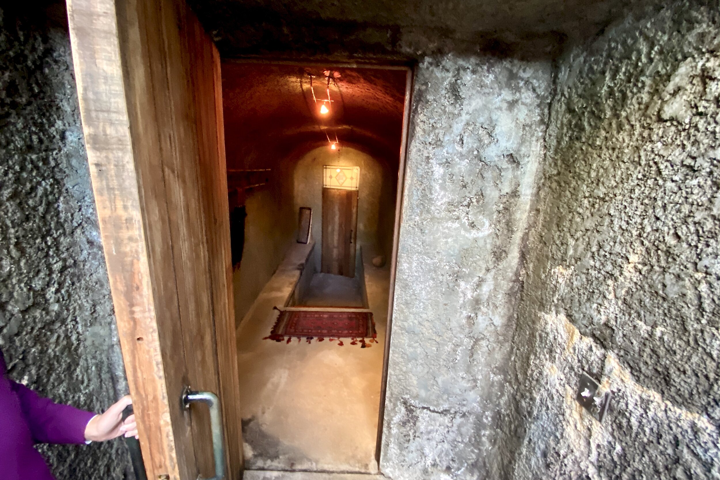
Here is our route to the parking area of the Constant Winery Home via this most unusual foyer.

Ron is opening the door…

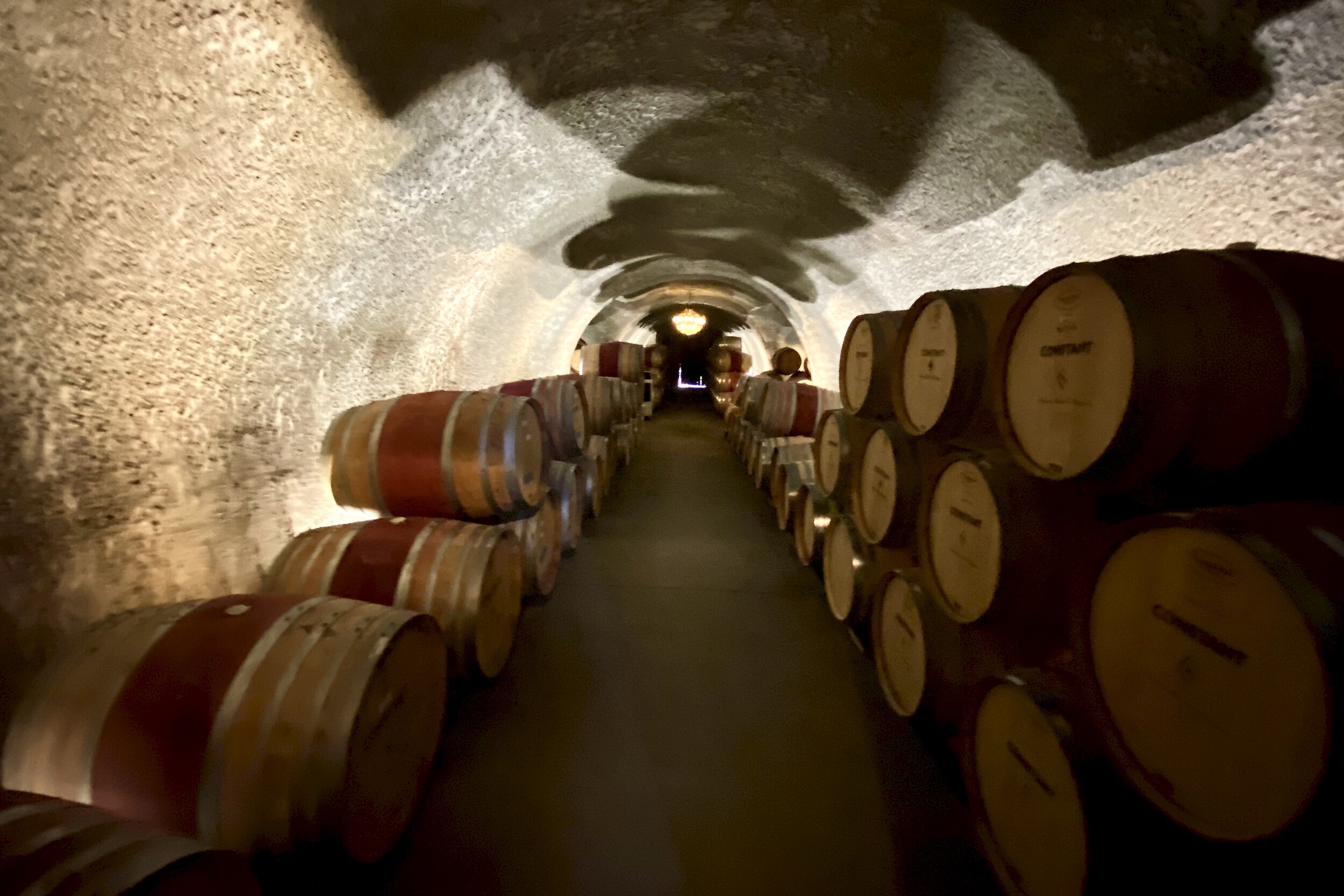
As we walk through, there are wine barrels stacked on both sides of the foyer which is underground. This maintains the right temperature.

And it is dimly lit with this custom made Venetian chandelier! We hope you enjoyed this tour as much as we did...It was a first foyer of this kind for us!

Branding Moment: Is This Brand too Bland Or Just Right?

We have always been of the opinion that one size fits one size. Each one of us is one size, Our method is to custom fit a brand to its function, to its market, and the individual, team or company. At that point, it resonates with its intended marketplace and communicates the message clearly. That is the criteria!

Our first impression in seeing the back of the truck (pictured above) was, what is being presented and who is Gavin Roy? Do we care to find out? If we were not in the branding business, we would not have noticed the truck or investigated it further.

It took a bit of maneuvering on the freeway, however, we managed to get a side shot that revealed the six part business as pictured above. The business seems to be focused on parties or large events. Where is the fun? Where is the phone number? 

 We applaud the script font for the initials. That offers a  hint of pizazz/fun.  

 What is your opinion is this brand bland or just right?  

November 11: Honoring Veterans & Active Members of the Armed Forces!

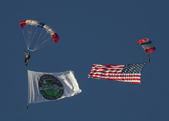
Two years ago, thanks to our clients unwavering support of the Navy Seals, we had the opportunity to witness a live demonstration of a special opps team taking down a villain.  Note, the canine soldier is part of the take down team.  

This annual event is held at the Pebble Beach resort at the beginning of the Legends Invitational Golf Tournament!  This event is Committed to creating a memorable occasion for all who attend, the Legends Invitational does so with the intent of raising awareness and funds for the National SEAL Museum and Memorial

The most touching moment is when the lone bagpiper walked slowly playing our National Anthem as one of the seals parachuted down holding our flag, and the other brought down the flag of the Legends Golf Tournament.  The audience was in tears, as were we.  Once again, we realize that Freedom is not free and sadly as one of the Medal Honor Recipients said, "Freedom is written in blood."

Today is an opportunity to be grateful to all those who work every day to maintain the freedom we have in the United States.  We cannot take this for granted ever!

Branding Moment: Is It Time to Bring Your Brand Into the 21st Century?

In crafting a brand, we are adamant about creating a great impression to the right audience. A first impression is what captures someones attention when looking to buy or list in real estate or in any other profession.  Every so often (15-20) years, a brand may need to be refreshed.  

Sometimes, it is a change of fonts, a brightening of colors while maintaining the well known identity. UPS 2003 change gave it that 21st Century look. (We have included a link to their logo history and images).  

Although we think this brand clearly expresses their services, we think they could us a bit of a makeover.  This company is over 15 years old.  At the time those colors were the "in" colors, and we remember the process blue as the "it" color, as well as that "screaming mi mi green" for many new businesses.  We are not suggesting that they change colors, just tone it down, and make their service icons more legible and less artsy, and bring it into the 21st Century. 

Is it time to bring your brand into the 21st Century?

Customer Experience: The Importance of your Most Precious Asset --Human Touch!

Luxury companies this year had a major wake up call, when the majority of complaints from their customers was their CX or what is known in our business as Customer Experience.  The #1 rated company for customer service by Forrester (an independent rating company) was not the usual suspects of Apple, Mercedes, or Nordstroms.  It was Trader Joe's.  

Customer experience is often mistaken for social media extravaganzas.  No one spends more on videos than the big brands.  They often use Hollywood stars, directors, producers, cinematographers and editors.  They hire influencers to blog about their products and pay them handsomely.  They have staffs to post on every conceivable social media outlet, 24/7...

Their websites are constantly optimized by the savviest SEO's know to mankind.  They appear with back links, and keywords in every nation where their goods are sold.  The customer can even create their wish lists, alerts for products, their own mini website etc.. They pay for placement of their products in movies, television, and in books.  They have the biggest and best software for CRM (Customer Relationship Management), which for the most part involves sending their customers emails and sale notifications...

No doubt, those companies are wondering,  after all we do, how dare customers complain about their experience?  In a luxury conference we attended, one of the executives of a big conglomerate of luxury brands mentioned that the most difficult challenge they face is customer experience across the various locations globally.  One of our friends loves one of their brands, but instead of buying it in her home store, she flies to Las Vegas to buy there, because of the personalize superb service she gets there.

How dare you compare us to Trader Joe's?

Trader Joe’s is not a luxury brand.  It is a luxury experience.  For instance, unlike any wine store, if you buy a wine, taste it and don't like it, you can return it for a full refund--no explanations necessary!  That simple gesture has added to their wine and spirits sales so much that the cost of the returned bottle is negligible.  And that applies that to every item in the store. Their human touch is unparalleled.  One of the guys that works there heard us mention that it was our anniversary.  As we checked out, he came over and handed us a big bouquet of flowers, and said Happy Anniversary...

Why focus and spend on customer experience

Exceptional services increases the bottom line and the referrals.  Studies have shown that: 

52% of customers will buy more and pay more because of good customer experience.  Every1$ invested yields $3.

85% will pay up to 25% more to ensure superior service

82% of people have stopped doing business with a company due to bad customer service

85% of customers who have a bad experience want to warn others from doing business with that company

If you are not focused on customer service, the gap between you and your competitor will increase.

The human touch is your most precious asset, use it as much as possible and remember although the Internet is a wonderful addition to our lives, the human touch cannot ever be replaced  by software.

Branding Moment: Telling It Like It Is!

In crafting a brand, we are adamant about creating a great impression to the right audience. A first impression is what captures someones attention when looking to buy or list in real estate or in any other profession.  The message has to be clear, easy to understand, and in an nutshell, Telling It Like It Is! 

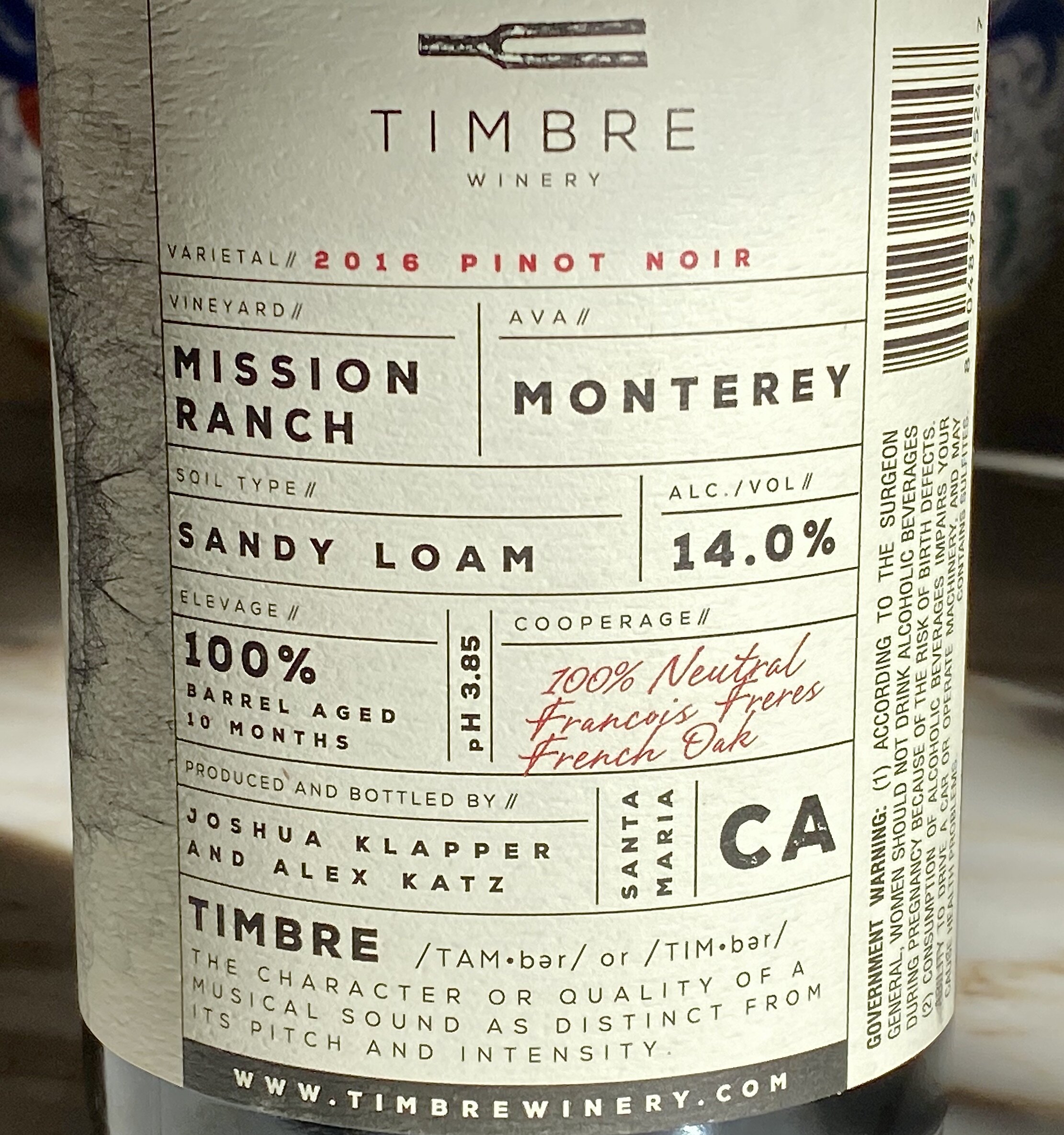
Our recent visit to see our friend Jane, owner of Carpinteria Wines, led us to trying a new Pinot Noir.  Pictured above is the back of the label.  We both appreciated that it was easy to read, and we could easily find the alcohol content instead of taking a magnifying glass to find it.   They also gave credit to the cooperage (i.e) the barrel maker. Plus, the winery took time to explain their brand name, TIMBRE!

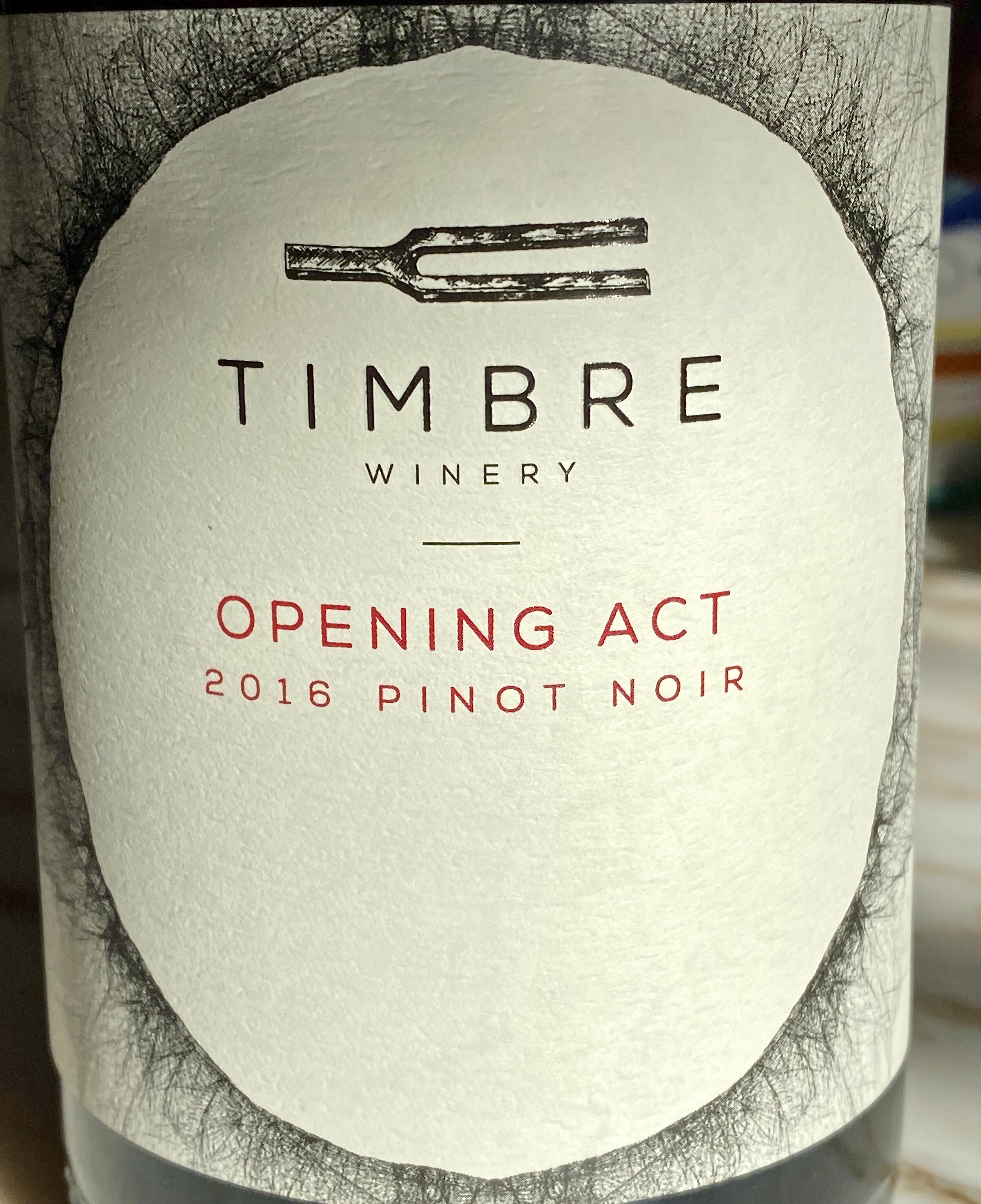
Here is the front label, and we both liked the brand name and the subtitle of Opening Act, for this Pinot Noir!  We bought it, enjoyed it, and recommend it.

Here are the winemaker's notes:

"The mix of Pinot Noir clones are co-fermented to create a wine that brims with red roses, strawberry and cranberry, but also offers cola and earthy components. The palate has a gorgeous weight and just a kiss of oak from the handful of once-used French oak barrels we slipped into the blend."

Is Your Real Estate Message Telling It like It Is?


Branding Moment: The Decision Making Process that Lead to a Yes!

In crafting a brand, we are adamant about creating a great impression to the right audience. A first impression is what captures someones attention when looking to buy or list in real estate or in any other profession.  It also applies to products and how we make decisions.  

Decisions are not necessarily made solely consciously,(stats and endorsements) but also unconsciously (the gut feeling).  Quite often if we are smart, we will take that gut feeling and honor it by perhaps delaying the decision or nixing it.  A brand that is well crafted will attract the right person to it. Here is an analysis of a simple buy.

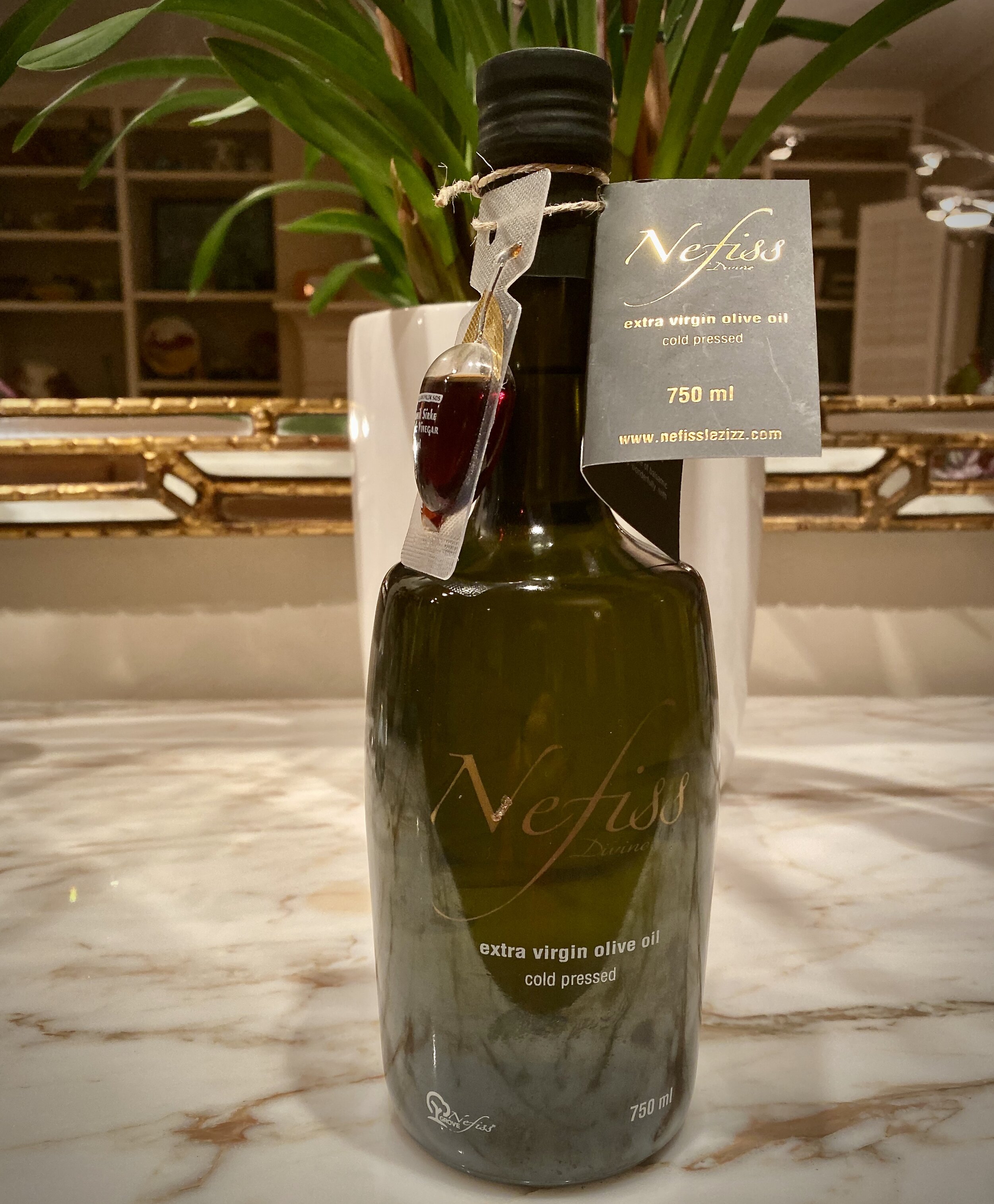
Pictured above is bottle of olive oil from a Turkish producer named Nefiss. This is how it ended up in my pantry. 

I am always interested in learning more, and to that day I had not tasted Turkish olive oil. I usually favor Italian or California olive oil.

I was attracted to it based on the design of the bottle, (attention to details).  

I read the little card attached to it describing the family and their story of the care and age of their olive trees in Turkey, (I like supporting family enterprises).

I was impressed that there was a sample of their balsamic vinegar on the bottle in the same shape as the bottle, (congruity in design and a sign of a generous spirit).

I found it in the take out store of Industrial Eats in Buellton, California.  We both admire the owners who are even more finicky than we are, when it comes to excellent products for their restaurant, and the products they sell...They became a subtle endorser brand.  In other words,  I trusted their judgment. 

Even, if I did not like or use olive oil, I would have bought it for a friend who does, based on my impressions. We all have an abundance of dominant impressions that guide our decision making.  When I ask people what led them to hiring someone, they come up with many of the thoughts I mentioned, and others that govern their decision making.  Quite often, the gut rules, because it is the least biased impression!

Have you ever analyzed your decision making process?

Branding Moment: Just One Glance, That's All it Took!

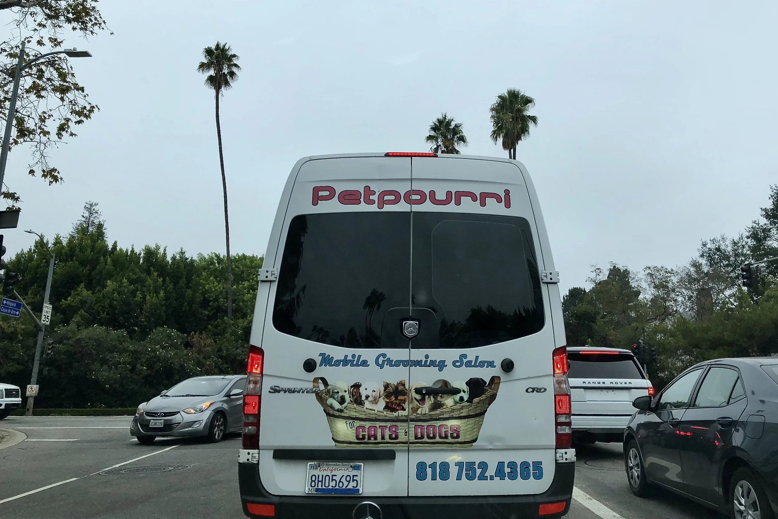
Unlike the brand I discussed on Tuesday, in our Branding moment, this one took just one glance, just one nanosecond to figure what this company does, a mobile grooming salon. I liked the brand name, "Petpourri" a take off on the word "potpourri: A mixture of dried petals and spices placed in a bowl to perfume a room. In this case, they cater to cats and dogs, clearly stated. And, the phone number is easy to read!

When we write these posts, it is with the intention to inspire those real estate companies and agents to elevate the look and feel of their website, to make it user friendly and give the client/customer a wonderful experience while browsing your site. This is our goal with every client/company we work with.

Branding Moment: It took 30 minutes to Understand this Brand!

When we write these posts, it is with the intention to inspire those real estate companies and agents to elevate the look and feel of their website, to make it user friendly and give the client/customer a wonderful experience while browsing your site.  
Once again we were stumped by this brand, and what their slogan meant (pictured above). And below is the brand logo.

It took me 30 minutes to figure this out, and I had to visit several sites to gain  an understanding. Finally, I found their site.  The site's first offerings are Tshirts with their logo and slogans. Below are beer pack of offerings.  

By surfing links, I was able to find their unique reason for existence.  The beer featured on this truck is described as:" Cashmere hops are joined by their juicy tropical aromas of citrus, pineapple and coconut.." It is one of their sub-brands of the Stone beers company.

Bottom line, think of the client's experience, when seeing your website.  Keep it simple, keep it clear and easy, do not make them guess!  Most people would have given up after the first manifestation of their social page...I would have!

Branding Moment: Simple, Subtle and Special--The Wow Factor!

When we write these posts, it is with the intention to inspire those real estate companies and agents to elevate the look and feel of their website, to make it user friendly and give the client/customer a wonderful experience while browsing your site.  

From our point of view that is worth more than all the  search optimization you could pay for. The wow factor results in word of mouth marketing, which is much more powerful and result driven. These are the principles we adhere to in our branding and design work

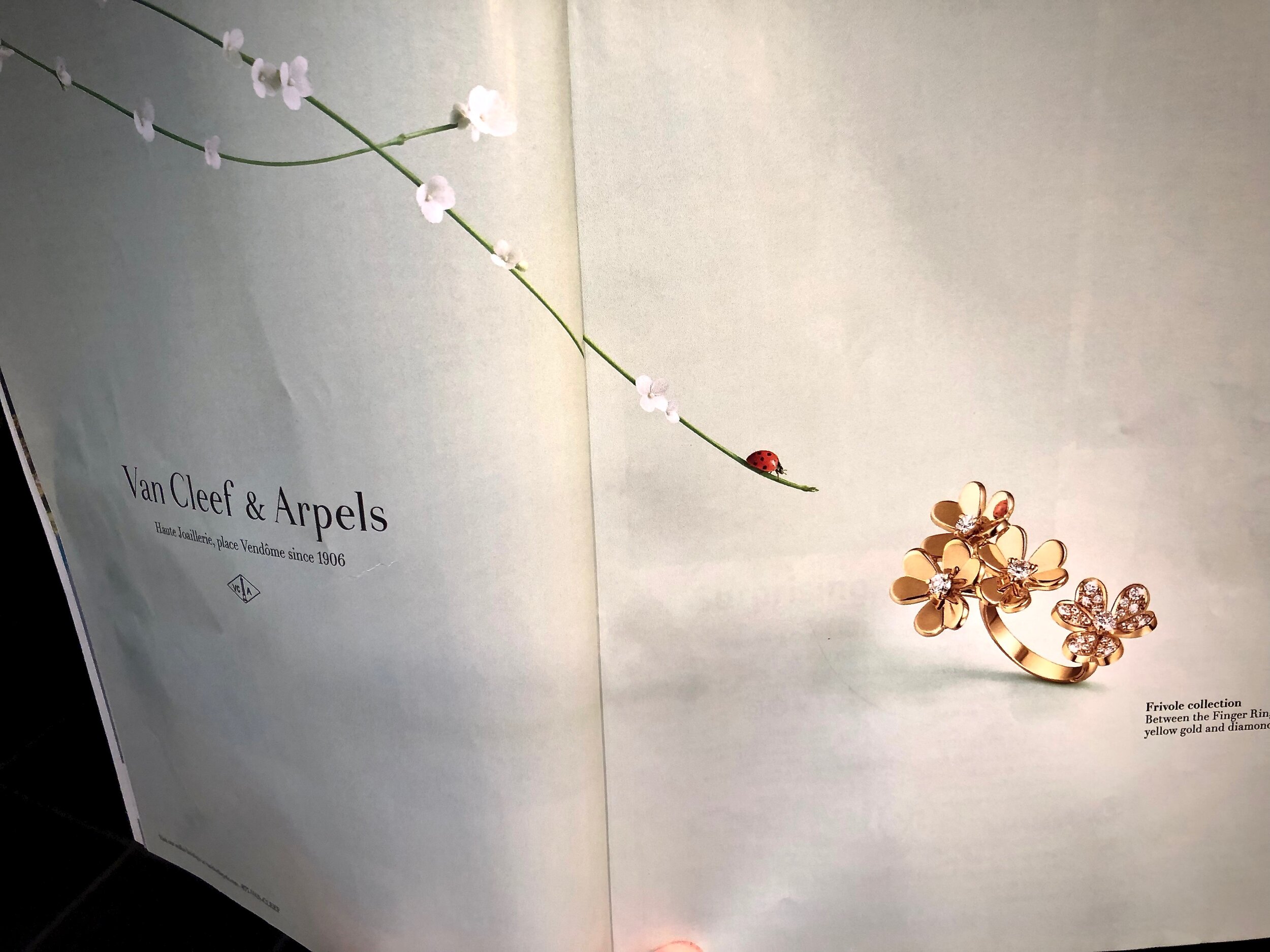
I really loved this ad Van Cleef & Arpels created for their latest ring, known as Frivole between the fingers ring!  If you look closely, at the mirror polish gold, you can see the reflection of the lady bug!  

Here is the description from their website, where you can see this creation up close; "Like so many flowers dancing in the breeze, the Frivole® creations by Van Cleef & Arpels stand out with their graphic and airy aesthetic. Mirror-polished gold bestows a singular radiance upon heart-shaped petals." 

The ad is simple, subtle and special!  If the reflection of the lady bug in the ring had not been there the ad would not have had that same impression! Details however minute completes the brand's statement of attention to detail.  If you take time to peruse the website, you will notice the ease of navigation, and the clean look and feel of it.  

Is Your Real Estate Practice a Work of Art?


The late great Steve Jobs believed that, like works of art, Apple computer chips should be signed by those who created them. While few customers ever saw the signed chips, the creators had a tremendous sense of pride about their work. If your real estate practice was a product would you sign it? Is it a work of art?

Recently, we enjoyed a pizza at one of our favorite restaurants, Industrial Eats, which is located about one hour up the coast from Santa Barbara, in the wine country It is worth the trip because the pizza there is the closest we have found to the best pizza in Italy. 

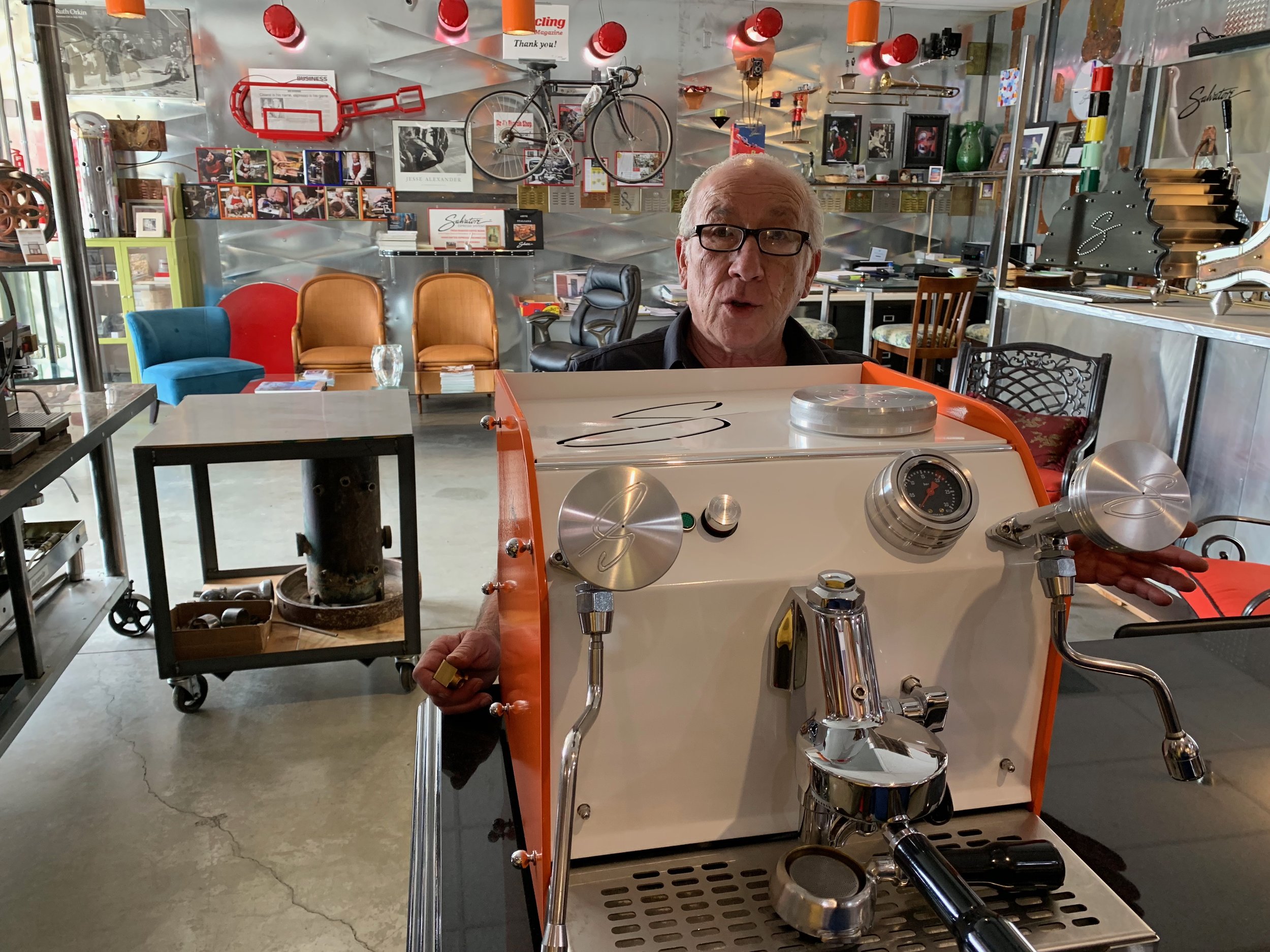
Before heading home, we each ordered espressos. After one sip we looked at each other with the exact same thought in mind: this was the best espresso we had tasted in he USA!  We looked for the server to ask if we could purchase some coffee to take home. She was at the massive espresso machine that looked like it was custom designed, imported from Italy and signed by the manufacturer, Salvatore.

Once we got her attention she told us that Salvatore is a local Italian craftsman who both restores and creates custom-built espresso machines for restaurants and home use by coffee connoisseurs. He also sources the coffee, composed of three kinds of beans, that he has roasted per his exacting standards.  It is called Tri Colore (like the three colors of the Italian flag-green white and red). 

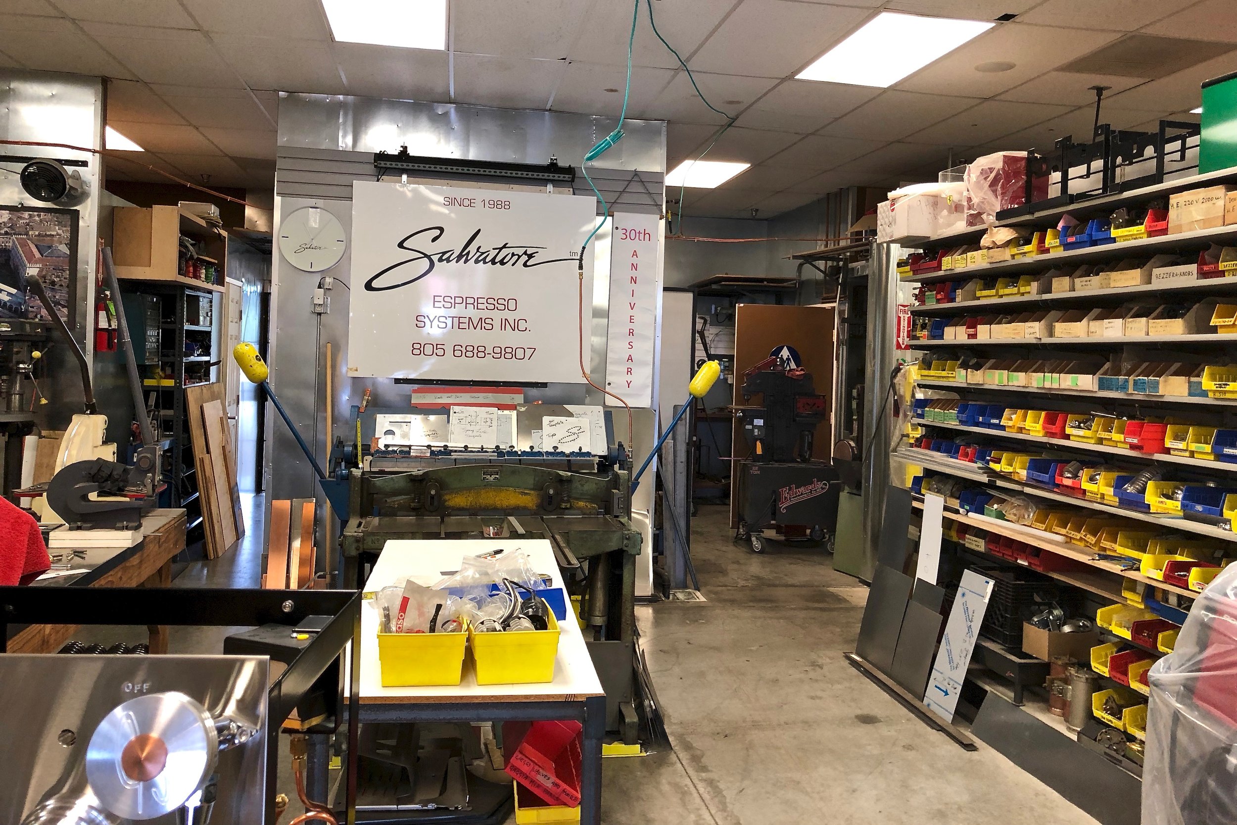
The next week we drove up the coast again just to meet Salvatore and his lovely wife Wendy who welcomed us with open arms, literally! They enchanted us with stories about Italy. And they showed us around their showroom/workshop while we sipped on espressos that Wendy artfully made for us.  We learned that they lived in our favorite Italian town of Florence where Salvatore made buckles and other metal elements for handbags and shoes for luxury goods companies like Ferragamo.

We wondered, in our age of automation and Artificial Intelligence, if Salvatore is the last of a dying breed of fine craftsmen who see their work as art, worthy of their personal signature. Or, were we witnessing the beginning of a new trend, spurred on by people seeking refuge from too much time in front of digital screens? 

Salvatore informed us that many of his customers are creating “coffee rooms” vs. “media rooms” that are more conducive to the art of conversation. Salvatore’s spectacular custom-designed espresso machines and delicious coffee are certainly conversation pieces. They tell a great story that resonates with those of us who truly appreciate, signature-worthy fine craftsmanship.

Is your real estate practice a signature-worthy work of art? 

Branding Moment: A Touch of Drama Is Memorable!

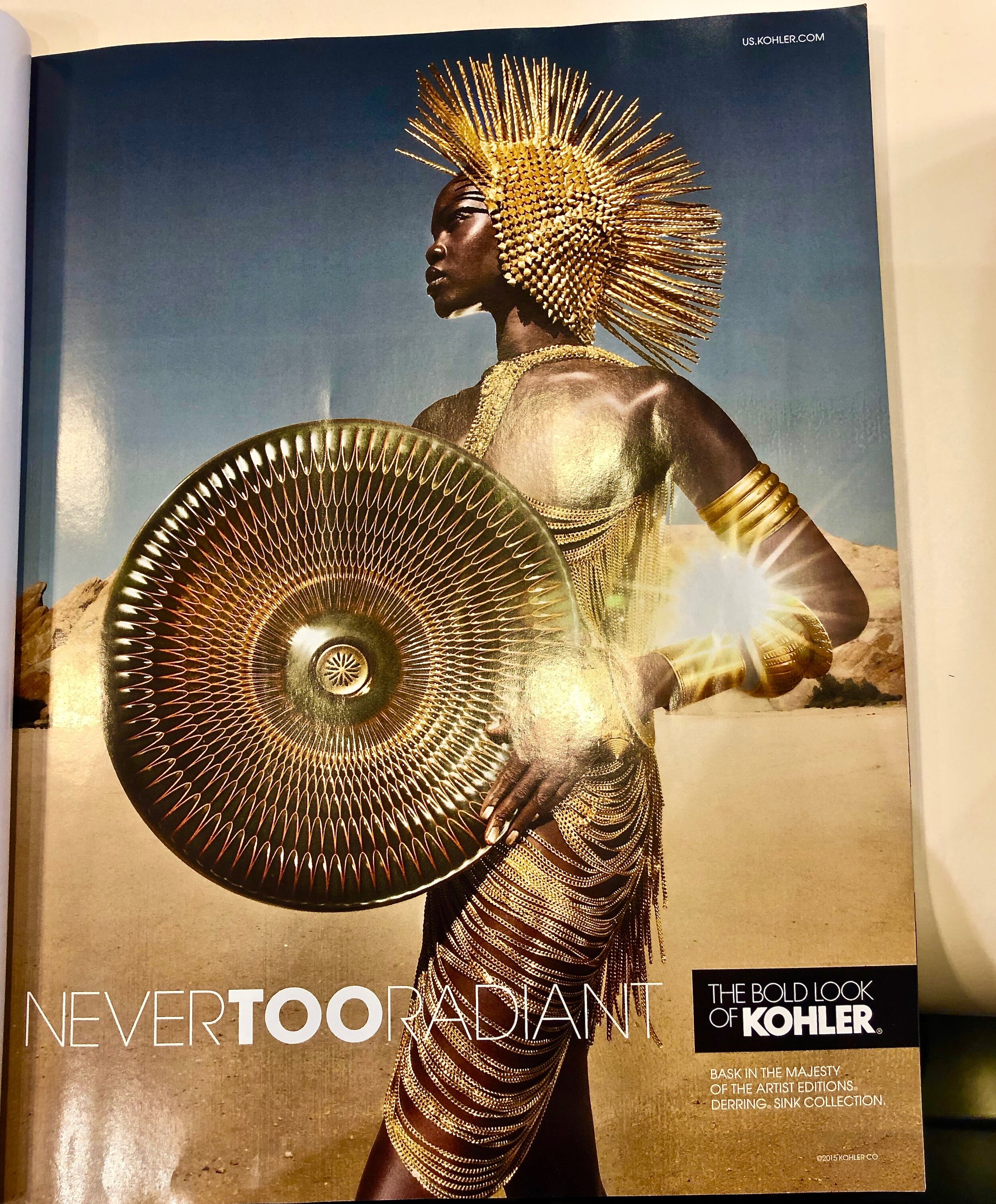
We enjoyed the creativity of this print ad in one of the current issues of Architectural Digest promoting their artist editions of sinks by Kohler.  And we appreciated the dramatic setting, the beauty of the model-and her costume.  A touch of a dramatic flair done right makes this ad memorable!

The sink is made of white porcelain and covered with a special glazing method which was inspired by master potters.  We have included a link, so that you can see it up close on the Kohler site.

We are firm believers that great real estate home photos should have a dramatic flair to attract potential buyers.  For instance, one of our clients here in Santa Barbara, started the photos of the home on his site of his recent listing with a picture of the outdoor patio— the fire pit lit, overlooking the ocean at sunset.  

That was the very picture the buyers fell in love with, and subsequently purchased the home!  They saw themselves sitting there with a glass of wine! That memorable touch of drama turned into the sale of this home!

Branding Moment: No Guessing--Clear Messaging!

Communicating clearly and succinctly as to what you do in real estate or any other profession on whatever medium works for you is essential when promoting yourself, in a brochure, on line, on the web or on the road as this truck pictured above does.

 In our previous post, we shared an image of a truck with a confusing message. The image of the truck above kept us guessing. SB AV (Santa Barbara Audio Video did not assume that those reading knew what AV meant. Then, they listed their services... We would definitely call them or suggest to someone their service based on the clarity of their message!

There is a big difference between clarity and obfuscation (def as the action of making something obscure, unclear, or unintelligible)!

Branding Moment: Do You Keep People Guessing as to What You do!

We cannot emphasize enough the importance of stating what you do clearly and concisely in your brand as well as in your profile.  If you keep people guessing, chances are they will not remember you, or refer you. Here is an example of a brand that had us puzzled and guessing as to what their product or service is.  

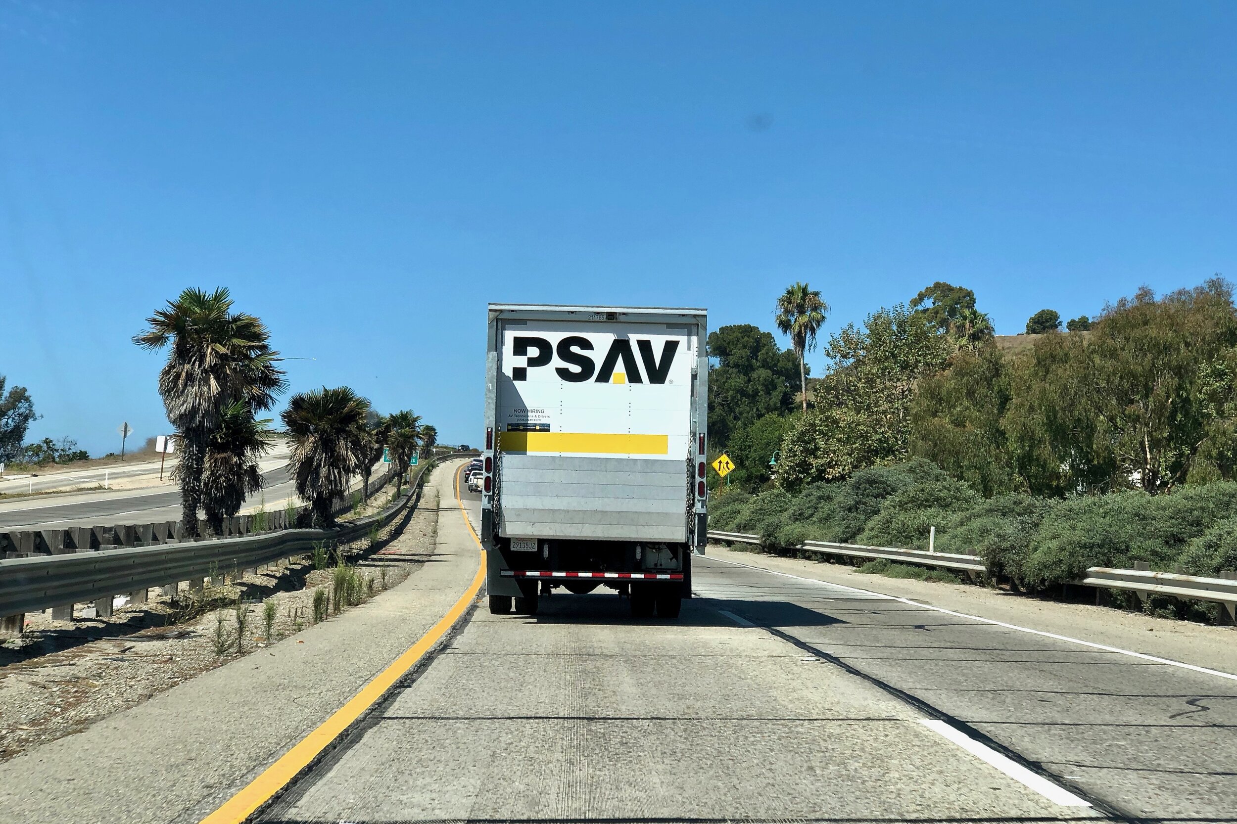
Driving on Highway 101 North heading to Santa Barbara, we were behind this truck.  Naturally we started wondering what PSAV stood for.  The logo did not give us a clue either. Ron came up with Audio Visual for the AV part.  

What did the PS stand for.  Traditionally PS stands for Post Script meaning written after,   If that was the intent, then it should have been AVPS.  We changed lanes to see if there was a slogan or more information on the side of the truck.   

What we saw is a larger version of the logo, and the URL.  Ron decided that perhaps they specialize in the movie industry by leasing Audio Visual equipment to studios!  And I said, why not inform all of us as there are many residents in our area that are involved in the California movie industry!

At home, we checked out their site, and here is what they do


WHAT WE DO

Connecting and inspiring people

Every event is unique, which is why we customize every solution to give your audience an unforgettable experience.


They are event planners and implementers...how difficult was it to communicate that, and create a logo that was memorable? 

Don't keep people guessing at to what your brand stands for and what you do.  It is a sure way to annoy them and not refer you!1

Branding Moment: A Name Out of Context?

In the last few years, there has been an explosion of craft beers on the market.  The branding of these beers have been creative and the visuals beautiful in many instances. Pictured above in one form of naming a product or service.  This is known as using a word out of context to the product.  

The word "mischief" is defined as; playful misbehavior or troublemaking, especially in children.  However, this is not a children's product, as the law requires that one is of legal age to buy or drink the beer. The accompanying colorful image is also out of context.

What is your impression? Do you like the name? The graphics? Would you be moved to buy, if you were a beer fan, or buying for someone who is?