Branding Moments: Brand Positioning or For Adults Only!

Although many individuals in every profession including real estate believe that a brand is colorful logo that has their name, picture, or company name it, a brand is so much more than that. If you want to build a strong brand,  you have to claim a place in the marketplace that consumers/clients are attracted to.  

In other words,  where do you fit in the mind of someone looking to employ your services in real estate? If you don't tell your potential client how you want to be seen (with a brand and a differentiating principle), you are just another real estate agent in the pond.

Pictured above is an example of brand positioning.  Many of us associate peanut butter,  with childhood.  Some of us still love peanut butter or other nut butters.  By positioning their nut butters for adults only, this Oregon based firm has come up with some  interesting combinattions that appeal to the adult palate, as well as favorites of old (Classic Salted Peanut Butter and Hazelnut Chocolate Spread/Nutella).

Just for fun, I compared the nutrition facts label on Nutella versus Eliot's version. Eliot has 4 carbs per one tablespoon serving vs Nutella's 11 and 1/2 carbs for one tablespoon. Since we are mindful of carbs we ingest, those numbers alone would have me buying Eliot's adult Hazelnut Chocolate Spread.  

Our mantra for our clients is "stand out or bow out!" If you don't find or claim your position in the marketplace, you will be just another agent sitting on the shelf hoping someone will pick you. 

First Rule of Marketing: Know Your Market Inside Out!

We are always amazed when marketing questions are answered with generalized advice.  The first rule of marketing is know your marketplace.  Each market is distinctly different, even in the same city or across the street from the community you work in.  No one size or strategy works for all.

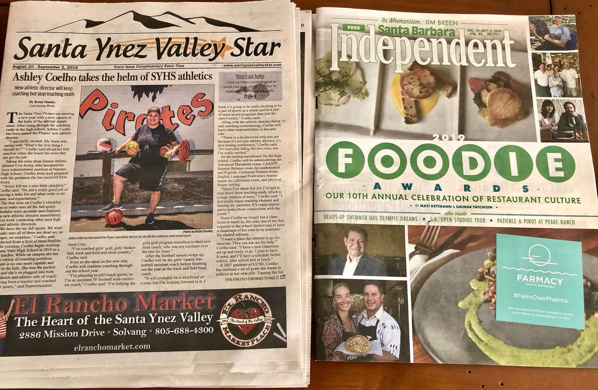
One of the most  common advice given is Print is Dead, don't waste your money!   That may be true for some communities, but it is not true for Santa Barbara County.  Pictured above it the Santa Barbara Independent publication. And the other side in the Santa Ynez Star.  Santa Ynez is a small city (population 4,418) with large ranches and vineyards. The savvy agents (those who make money and have listings) know that this works for them.

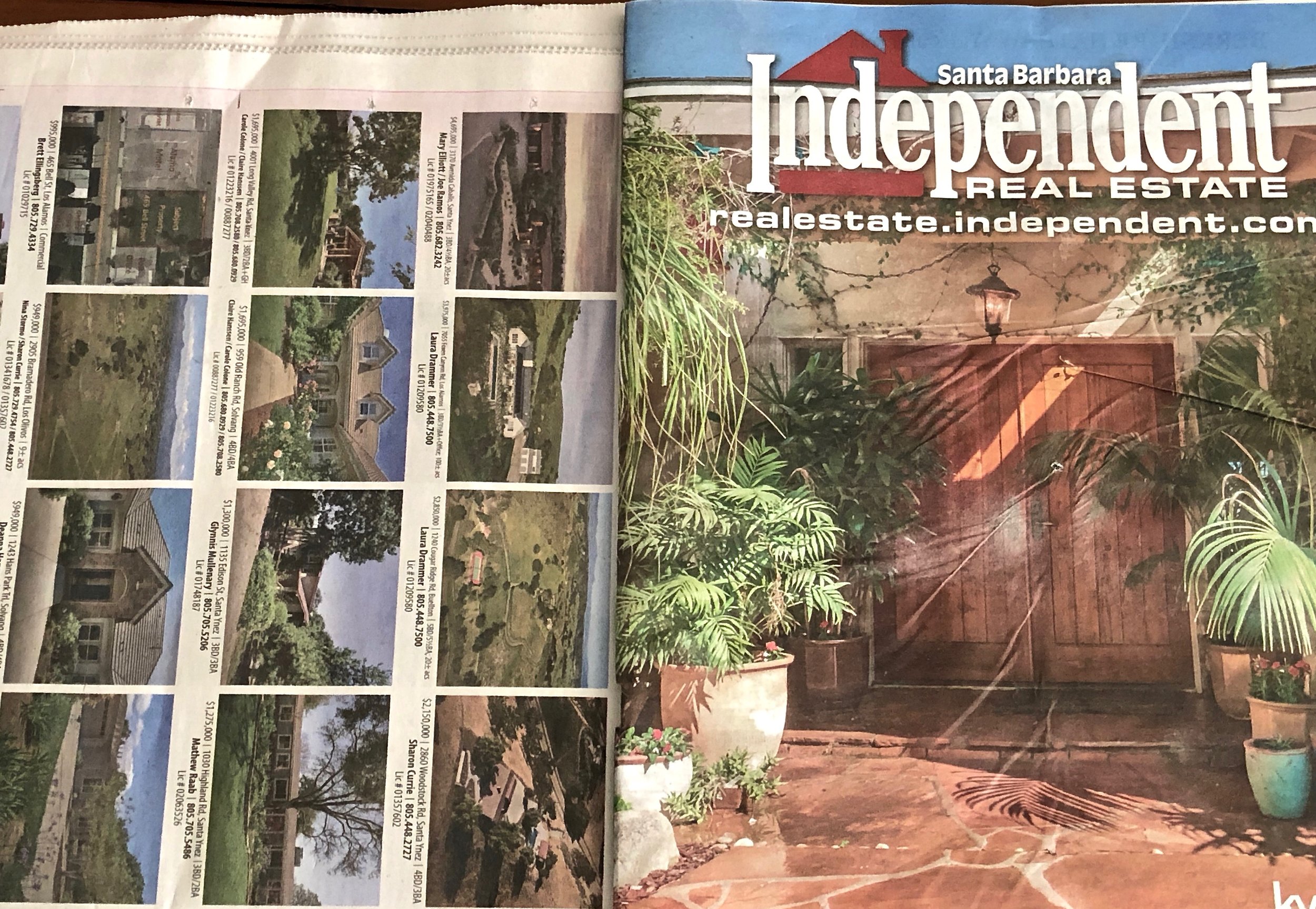
The Santa Barbara Independent Real Estate has created a front page for the real estate section by adding its banner on the back cover, so it looks like two publications in one.  It is so popular that I noticed the pile dwindling as we were having lunch at Superica, last Thursday. 

The paper  comes out every Thursday without fail.  It is distributed to every retail area, restaurants, hotels, and every newsstand, etc. I counted 28 pages of real estate inventory. . Santa Barbara population including the independent cities is (100,000) .We also included the Santa Ynez Star showing the back cover page with real estate ads.

This morning at the Baker's Table, in Santa Ynez, I noticed that people were picking up their coffee and pastries as well as the Santa Ynez Star.  In both of these instances, print has value in marketing the property as well as the agent and their brand.

In one of the communities we work in on the East Coast, our clients promote their listings every week in their weekly paper.  The other agents do not because they know better--"print is dead", they will tell you with great certainty.  Guess who has the lion's share of listings in this community?  Our clients keep getting listings on a regular basis... 

Know your marketplace inside and out.  As we work around the country, we know that newspaper ads may not work in your neck of the woods, and we also found that videos are rarely viewed in other locales. We have also learned that glossy magazines are well received in certain communities.  All those generalizations mean nothing, unless you research and find out what works and what does not.  You will be surprised.  In marketing, one size does not fit all.

Branding Moment: The Intention Is Good, & the Message Confusing!

The whole intent of luxury real estate branding and marketing is to have a clear cut message. In order to have the desired impact this message should be easily understood. This is the primary way to achieve visibility and recognition in your market place.

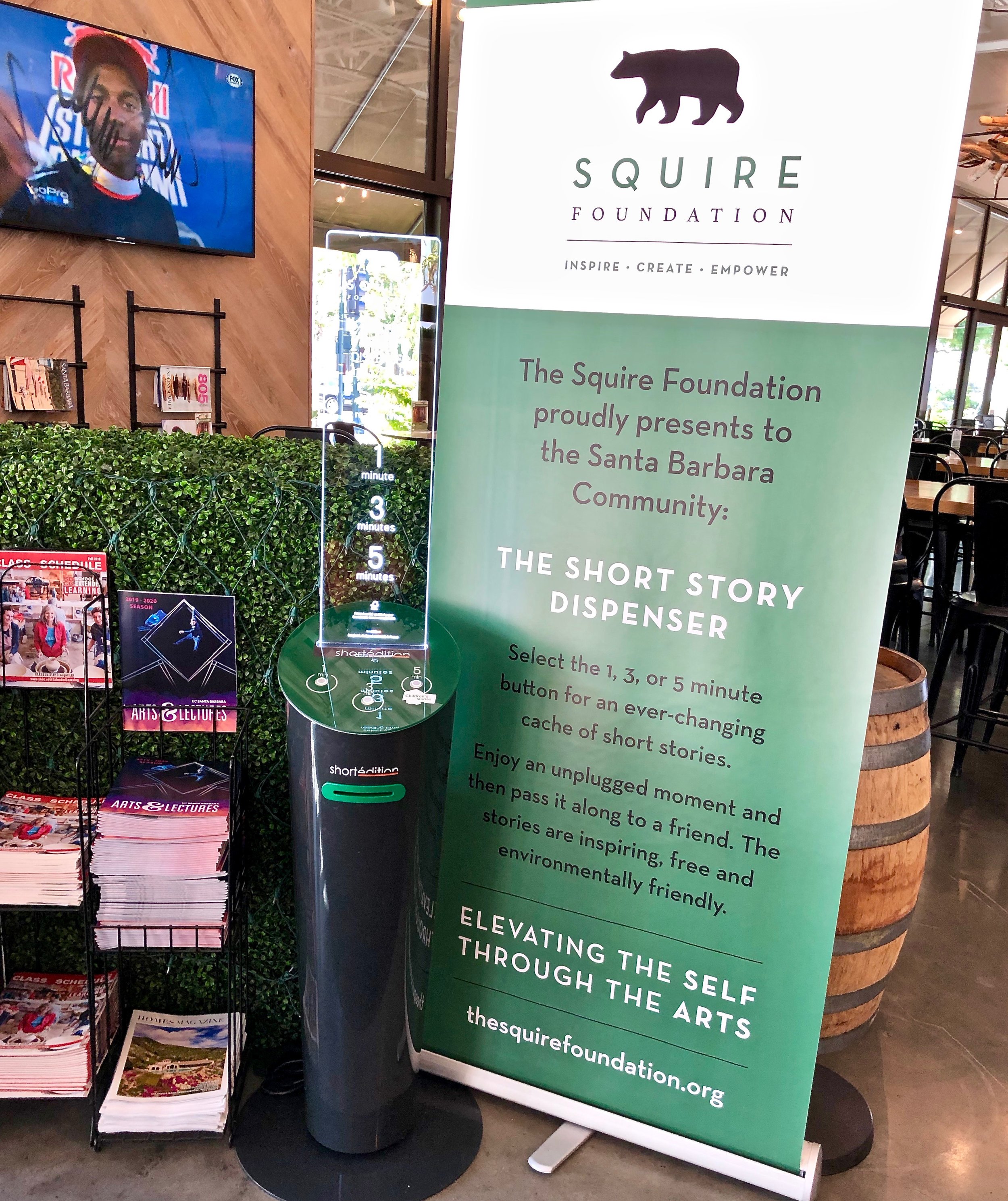
Pictured above is a kiosk and a plexiglas sign from the Squire Foundation. This is located near the entry door to the Santa Barbara Public Market which is a large warehouse one story building that is home to various restaurants and a wine bar. It caught our attention, as did the claim that this was an unplugged moment to enjoy.  We found it ironic that the whole thing faced the sports bar/restaurant with 10 big screen TV's covering the sporting events around the world.

I chose a 3 minute short story.  I know that my high school English teacher would have labeled it as "purple prose".  It means,  "text that is so extravagant, ornate, or flowery as to break the flow and draw excessive attention to itself."  And I did not get the story at all.

Then, I asked the guys at the wine bar about this story/telling machine.  They told me that it has been there for three months, and it came from somewhere in England. They have tried the stories and thought, they were "just OK".  Clearly they were underwhelmed by the whole idea. That brought to mind a quote by George Bernard Shaw commenting on the fact that the British had a hard time understanding American English and vice versa:, "The United States and Great Britain are two countries separated by a common language."

Given that I was going to write a blog about this, I went on line and discovered that the foundation was located in Santa Barbara and not in England.  Here is their mission statement, "the Squire Foundation is a non-profit empowerment foundation, dedicated to civic and educational programs for artist, curators and all manner of creative people."

As I watched people filing in for lunch, no one looked at the kiosk or helped themselves to even a one minute story.  They were focused on that TV screen....It brought to mind another quote," the road to hell is paved with good intentions."

The Moment of Truth Or Five Steps to Developing Repeat Business!

In marketing speak, there are five moments of truth that a potential client experiences when doing business with you.  If you satisfy their needs at these crucial moments in the cycle of customer acquisition, you will have a client for life.

#1 Before They Meet You/Self Service Mode

Whether they hear about you from someone they know, see a sign on a home, they find you on a search engine, on a blog post, your website or an ad in print or on line, a video, they will experience a sense of relief.  This is someone who may be the right person to help me, to answer my needs.  Your website is your silent salesperson as real estate professional regardless what your chosen niche is in the real estate field.

If your website appears at first glance to be the most authoritative site in your marketplace, if it has the best graphic interface, and is also the best  organized and easiest to navigate, you have a very good shot at  keeping them coming back to do their research.  While they are in this “self-service” mode, before they meet you, they are still operating from a favorable, lasting first impression that occurred in the first moment of truth.

#2 First Meeting

The second moment of truth happens when they actually encounter you in person, by phone or email, etc..  They are either satisfied or dissatisfied with their initial encounter with you.  They answer the question, "should they  proceed to buy or list with your assistance?".  If they answer, "yes",  they are convinced that they have found the right agent, that you will produce their desired result. 

When potential clients are referred, they are already predisposed to liking and trusting you.  They have already experence the first "moment of truth".  Now it is you turn to make an indelibleimpression.  Think of it as your elevator speech: Do you stand out or are you forgettable.  Are you instantly perceived as an expert?  

#3:When You Deliver Your Services

Meeting expections in the process of selling or acquiring a home is like being on stage and delivering a flawless performance of a real estate transacting.  Every step of the home buying or selling process is an opportunity to shine like a top notch performer.

The third moment of truth occurs when your initial transaction is complete and they are satisfied that you have delivered on your promise of value. Here you have met or exceeded their expectations, or you have disappointed them.  If the latter is true, the cycle of customer acquisition ends right here.

#4: When They Refer You

The fourth moment of truth occurs when they refer a friend to you.  This further affirms their satisfaction.  This is an opportunity to create another source of referrals for your business.  Take excellent care of their friend, and this friend will send you their friends.  Word of Mouth marketing still reigns as the best form of marketing.

#5: When You Have Their Repeat Business

The fifth moment of truth occurs when your clients are ready to buy or sell again and they call you instead of switching brands which means calling your competition.

True market leaders have mastered all five of these moment of truth.  

Branding Moment: Analysis of a Real Estate Brand Personality

On our travels through Santa Barbara, we often see this ad on the back of our buses, for this local real estate firm. This is what we refer to as "brand personality."  By expressing on their ad, that their real estate agents are attorney trained,  they have positioned themselves as having competence

competence personalityis defined as:
Reliable:hardworking, secure efficient trustworthy, careful, intelligent and successful.
Intelligenttechnical, corporate, serious.
Successfulleader, confident, influential.

In the corporate world, IBM as an example of a brand with a competence personality. Like IBM,(aka Big Blue), this brand uses Blue as its  primary brand color.  The expression "true blue" means dependable, reliable, stable, and the shade of blue is generally associated with these characteristics.

Keep in mind, that this real estate company’s unique promise of value is that they are owned by a practicing real estate attorney.  The brand personality is a subset of the unique promise of value, and is part of the overall brand identity, as is the color choice.

This brand will attract those who can identify with its personality, because it is a reflection of how they see themselves.  Remember, people like to do business with people like themselves.

Do you know your brand personality?

Branding Colors: Can You Hear The Sound of Color?

We are always fascinated by color combinations can work together and catch our attention.  We both have often remarked that certain colors speak to us.  And in our real estate related branding work we research the colors that our clients like that speak to them.   

As we delve into working with color combinations, we will ask our clients: "does this speak to you?"  It has to resonate, or as defined in the dictionary to relate harmoniously to that client or company.

Recently I read a book about people who actually hear in colors.  This is called synesthesia.  Not all those individuals are necessarily musicians, some are artists, and some are not.

People with synesthesia related to music may also have perfect pitch because their ability to see/hear colors aids them in identifying notes or keys. The colors triggered by certain sounds, and any other synesthetic visual experiences, are referred to as photisms. (Wiki)

Wassily Kandinski, a Russian artist, was known for his abstract paintings and the use of bright colors as pictured above in this photo of the Church of St Ursula (public domain photo).

Although he was not a musician, he talked about the sound of color.

"The sound of colors is so definite that it would be hard to find anyone who would express bright yellow with base note, or a dark lake with the treble."

"Color is the keyboard, the eyes are the harmonies, the soul is the piano with many strings. The artist is the hand that plays, touching one key or another, to cause vibrations in the soul."

And here is my favorite quote,

"Lend your ears to music, open your eyes to painting, and... stop thinking! Just ask yourself whether the work has enabled you to 'walk about' into a hitherto unknown world. If the answer is yes, what more do you want?"

Can you hear the sound of color?

Branding Moment: The Unique Value Proposition Hooked Us In!

We rarely follow guidebooks when choosing a restaurant when we travel.  Most of the time, we will ask a local, or our hotel concierge, or we more often than not, we let our intuition or branding nose guide us.

After several hours of walking in Paris, it was lunch time.  We walked into Lavinia, a wine store just to explore.  As we looked up, we noticed they had a restaurant, on the second floor. (pictured above) When we got up there, the host told us they had great food, and showed us the menu which we liked. 


As I (A) looked up I saw this sign on a blackboard pictured above.  Translation: We serve all our wines at the store price.  In other words, unlike other restaurants, there is no markup on their retail price. And there it was their unique value proposition which hooked us in.  And you can also see that same statement on their red wall in the restaurant.

Here is the unique value proposition defined:
Also known as a uniqueselling proposition(USP), your UVPis a clear statement that describes the benefit of your offer, how you solve your customer's needs and what distinguishes you from the competition.

Of all the restaurants we have eaten in globally, nationally and locally, this was a first. Some had a wine store as part of their premises and they had the usual mark-up. 

By the way, our lunch was delicious as promised as were the wines our waiter suggested. We were so glad we arrived early, because within 10 minutes of us sitting down, the place was full with the local business people.  Next time we are in Paris, we look forward to having another meal there. 

Will your unique value proposition hook your market in to do business with you?

Luxury Marketing At Its Best: A Color Palette of Possibilities!

Sometimes, you can create a superb marketing piece using the whole spectrum of colors, instead of focusing on just your brand color.  I took this photo in Milan of the *Hermès store window to illustrate this point. 

The only visible brand color in this display is the orange purse in the upper left corner.  Would you have guessed this is Hermès, if I had not revealed it?

*Hermès International S.A., or simply Hermès is a French high fashion luxury goods manufacturer established in 1837. It specializes in leather, lifestyle accessories, home furnishings, perfumery, jewellery, watches and ready-to-wear. Its logo, since the 1950s, is of a Duc carriage with horseWikipedia  

Branding Moment: Not so Puritan Taboo Slogan near Hot Springs Rd!

Ron and I spotted this truck from Puritan Bakery with its slightly racy slogan of "Best Buns In Town". The word "puritan" means: one who practices or preaches a more rigorous or professedly purer moral code than that which prevails.  The slogan can be interpreted in so many ways. We leave that to your imagination. 

The juxtaposition of the truck with the exit of Hot Springs Road was a moment of synchronicity.  We were wondering if they were going to take the Hot Springs Exit to deliver best buns to the Von's grocery store there...They did not!

According the their website, which has an image of a man in a Puritan costume and slogan, this is the secret to what makes best buns:

Puritan Bakery is committed to baking our bunsand breads the old fashioned way -- the way you would if you were making bread from scratch at home. Because of this commitment, we still use a sponge and dough process, rather than the faster and cheaper brew dough, straight dough or modified sponge systems. The sponge and dough process takes 7 hours, but we believe that the best things are still worth waiting for.

This brand caught our attention and gave us a chuckle.  We will remember the name, no doubt about that.  The bakery started in 1930, and they are still going strong. The right market is still buying.Just like in Real Estate, there are many brands and markets for each one as long it lasts.

We would definitely mention them if someone asked us what kind of hamburger or hot dog buns to buy. Their baking method is impressive.

However, we are not their customer.  If we are going to indulge in bread of any kind, we would buy artisan bread made locally.  

Branding Moments: The Importance of Heritage vs High Tech Auto Pilot!

In branding a company or an individual in luxury real estate or in any other real estate field, the concept of heritage is an asset and a  great differentiator. Brand heritage (something handed from the past: experience or a way of doing business). There is plenty of merit is high touch (incorporating the old fashioned) versus high tech (auto pilot) real estate.  

This can inspire confidence when a consumer is making a choice of which agency or agent to pick when buying or selling a home.  It can also imply great service or what is often referred to as high human touch or white glove service. Here is an example of a trend we have noticed in wine-making that is applicable in real estate.

In the world of wine production, which is even more competitive that the world of real estate, we are noticing heritage as a differentiator. Pictured above in the window of a wine store in Paris is the lePuywine brand.  They have been in existence since 1610.  Their slogan "authenticity reflected in their terroir, (terroir is the composition of the soil that gives the wine its unique flavor)."  

The authenticity is the illustration of the horse and the plow, which means that their wines are produced bio dynamically. They are still using horses to plow the soil around the vines, because horses are lighter than tractors and do not damage the vine roots.  They also use natural fertilizers, as they did in the old days of wine making, which contributes to the health of the vineyard.

More wine producers are reverting to bio-dynamics.  "In a blind tasting of 10 pairs of bio-dynamic and conventionally made wines, conducted by Fortune Magazine and judged by seven wine experts including a Master of Wine and head sommeliers (wine stewards), nine of the bio-dynamic wines were judged superior to their conventional counterpart. The bio-dynamic wines "were found to have better expressions of terroir, the way in which a wine can represent its specific place of origin in its aroma, flavor, and texture."(Wikipedia)

We have often preached the importance of high touch in all real estate whether it is luxury or industrial real estate.  Not a day goes by when a new technology is offered to bypass the human touch, essentially being on auto pilot as the end all be all.  The clients and companies we work with are known  and praised for their impeccable customer service which software will never replace.  


Happy Birthday America: Thoughts & Quotes on July 4th, 2019!

Today, America is 243 years old.  We are both extremely proud to be Americans. Regardless of what any critic may say about our country, we think this is the best place on Earth for us.  Here are some quotes we liked:

“We on this continent should never forget that men first crossed the Atlantic not to find soil for their ploughs but to secure liberty for their souls.

– Robert J. McCracken

“Independence Day: freedom has its life in the hearts, the actions, the spirit of men and so it must be daily earned and refreshed – else like a flower cut from its life-giving roots, it will wither and die.”

– Dwight D. Eisenhower

“Freedom lies in being bold.” 

– Robert Frost

“We must be free not because we claim freedom, but because we practice it.”

– William Faulkner

and last on a humorous note...

“You have to love a nation that celebrates its independence every July 4th, not with a parade of guns, tanks, and soldiers who file by the White House in a show of strength and muscle, but with family picnics where kids throw Frisbees, the potato salad gets iffy, and the flies die from happiness. You may think you have overeaten, but it is patriotism.”

– Erma Bombeck

Wishing you  all a delightful Fourth of July

Ron & Alexandra Seigel


Branding Moments: Is This a Case of Brand Identity Crisis?

In branding, it is of paramount importance to define who you are as a real estate agent, or company, what you do, as well as who your intended target market is.  A brand identity becomes the core foundation of your strategy and marketing.  

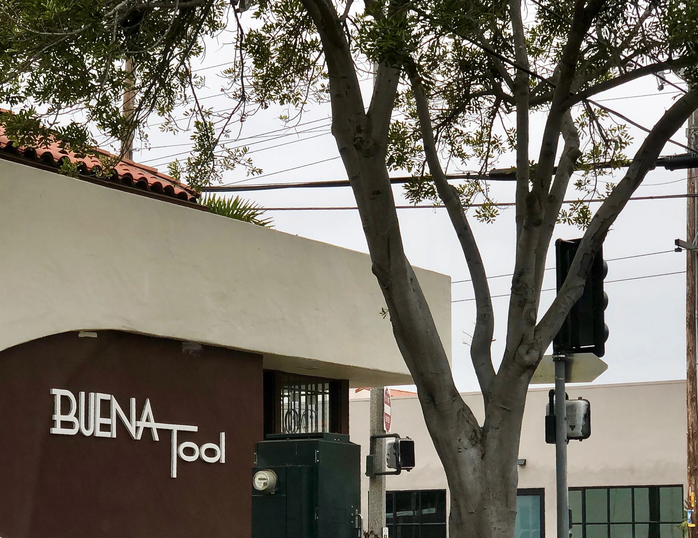
Pictured above is a building that we drive by frequently.  Clearly based on the description, we are not their target market.  We have plenty of tools we may need, and if we needed something in the tool world, we would stop at Ace Hardware, which is around the corner...

Recently, we noticed a new bright yellow banner sign on the back of the building.  It reads, "We Are Not Just A Tool Store".  So what are they besides a tool store!  This sign adds to the confusion. No explanation is given?   

Is this a case of brand identity crisis?

Surprise Your Clients with Brilliant Customer Service

WATCH THIS 3-MINUTE VIDEO TO DISCOVER BRILLIANT CUSTOMER SERVICE

Many luxury real estate marketing professionals tout their customer service as different and better than their competition. Yet, in the realm of luxury real estate brokerage it is rare to find customer service that is truly remarkable. If you want your customers to fall in love with your brand, your service must be consistently brilliant and full of surprises so that it sparks word-of-mouth advertising.

Branding Moments: Do Your Brand Colors Reflect Your Marketplace?

The colors of a brand are part of its identity.  It is the first thing, people notice.  Colors are impressions and they are associated with feelings, impressions and experiences, that the onlooker identifies with or does not.  Pictured above is a scene from Carpinteria State Beach at low tide a week ago.  If we were to do a brand for Capinteria real estate, this would be a palette of colors we would draw from if appropriate.  

In real estate, brand colors should  include and reflect the marketplace of the real estate agent and or company.  These colors can be dominant or subtle.  It depends on the overall strategy and the personality of the agent and the marketplace.  Pictured above are anemones on the reefs which are only visible at low tide.  Their color reminds us of the Tiffany blue.

In real estate, brand colors should  include and reflect the marketplace of the real estate agent and or company.  These colors can be dominant or subtle.  It depends on the overall strategy and the personality of the agent and the marketplace.  Pictured above are anemones on the reefs which are only visible at low tide.  Their color reminds us of the Tiffany blue.

Although we have Pantone color swatches in our arsenal as well as software to help us get the right hues, we find that nature's colors are one of the best sources of inspiration when it comes to getting it right. This is one of the reasons we take so many photos of different flowers, trees, vegetables, landscapes, seascapes when we travel of our client's marketplace.   Pictured above is another rich palette of colors to choose from.

Pictured above, that section of orange red is part of a sea star (formerly known as starfish) that has tucked itself in among the mussels and other crustaceans.  In our area, we have seen burgundy sea stars, yellow ones and these reddish orange ones.

Whether one uses just one or two colors depends on the overall strategy.  For one of swho sells land as his niche, we tested the dirt color and used it as one of the brand color with an accent of orange (his favorite color). We added a hand drawn illustration of the California Oak which is the signature tree on those large ranches, vineyards, and estates he sells throughout the tri-county area.

Using brand colors that reflect the marketplace is another way to communicate your authenticity.  Remember colors are a form of perception that people identify with and are attracted to.  Do your brand colors reflect your marketplace?

Branding Moments: Lost In Translation in Beverly Hills!

When it comes to branding strategy, creating a mystery can sometimes work and be a point of attraction for one's target market.  Here is an example of a new brand we saw, that created a mystery for us. No doubt, plenty of creative thinking went into this, however for us (who live and breathe branding), this was lost in translation!!

This past Tuesday, we drove down to Beverly Hills for our monthly visit. After enjoying a cappucino, we decided to scope out the other side of the Golden Triangle to see what was new and interesting.  

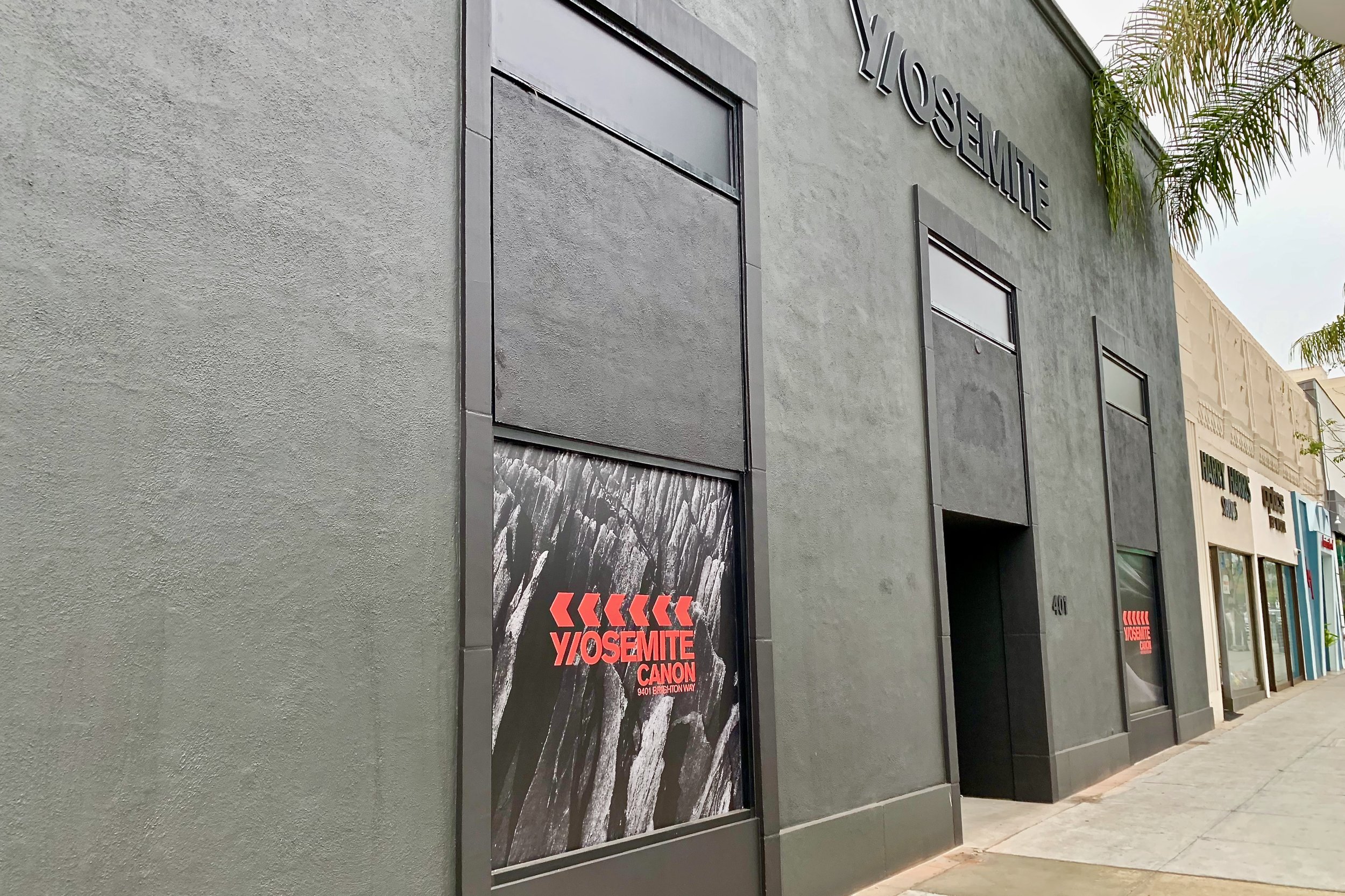
Pictured above is a new large corner store painted dark gray. Was the dark gray mimicking the granite walls of El Capitan at Yosemite National Park? Is that why the store is named Y/OSEMITE!

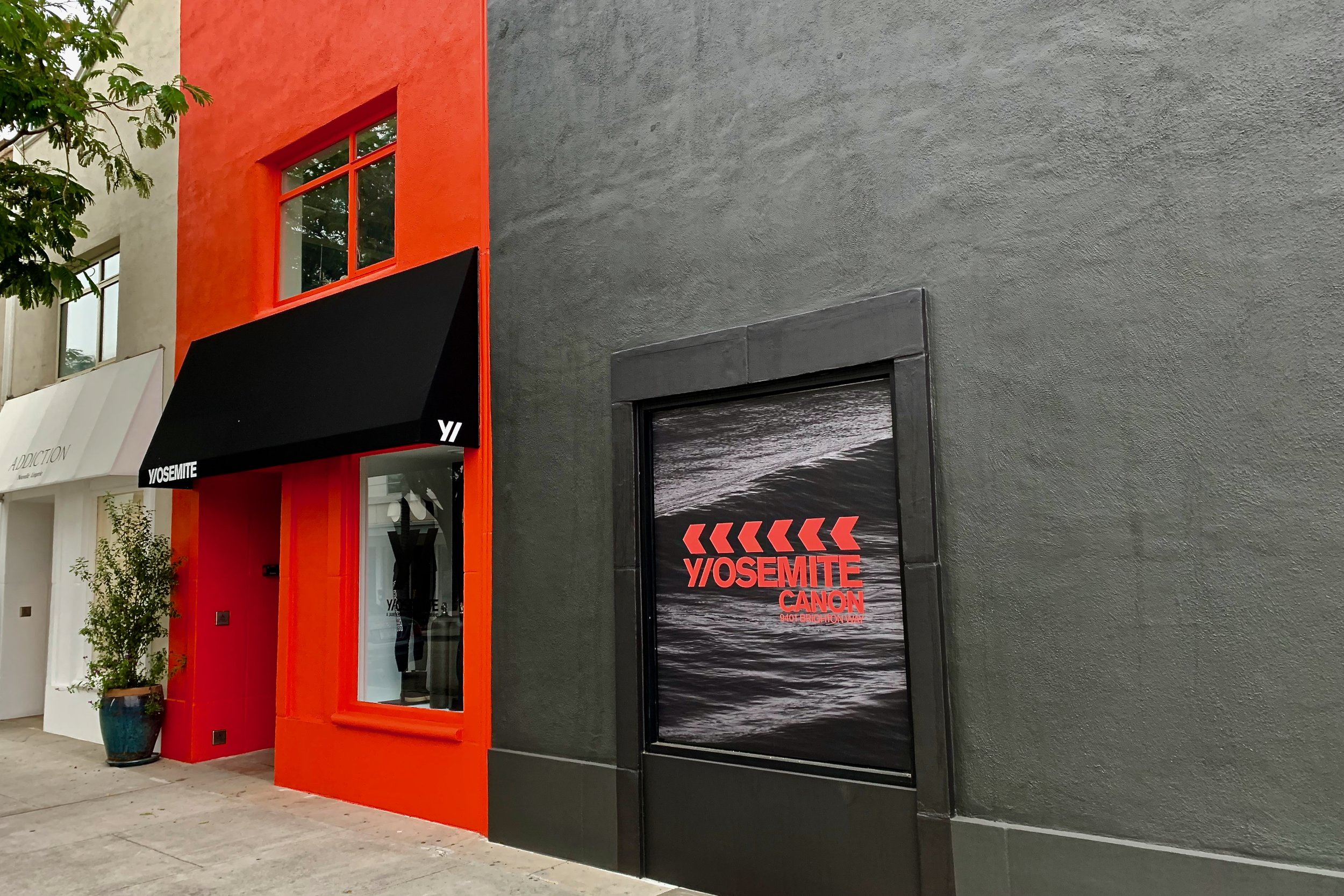
We parked on Brighton Way side to get a closer look. Here is the Brighton Way side continuation Y/OSEMITE side of the store.  The fire engine red building with the black awning reveals the answer with an actual store front and a door to come in (pictured below). Now that red could not possibly refer to our National Park.  

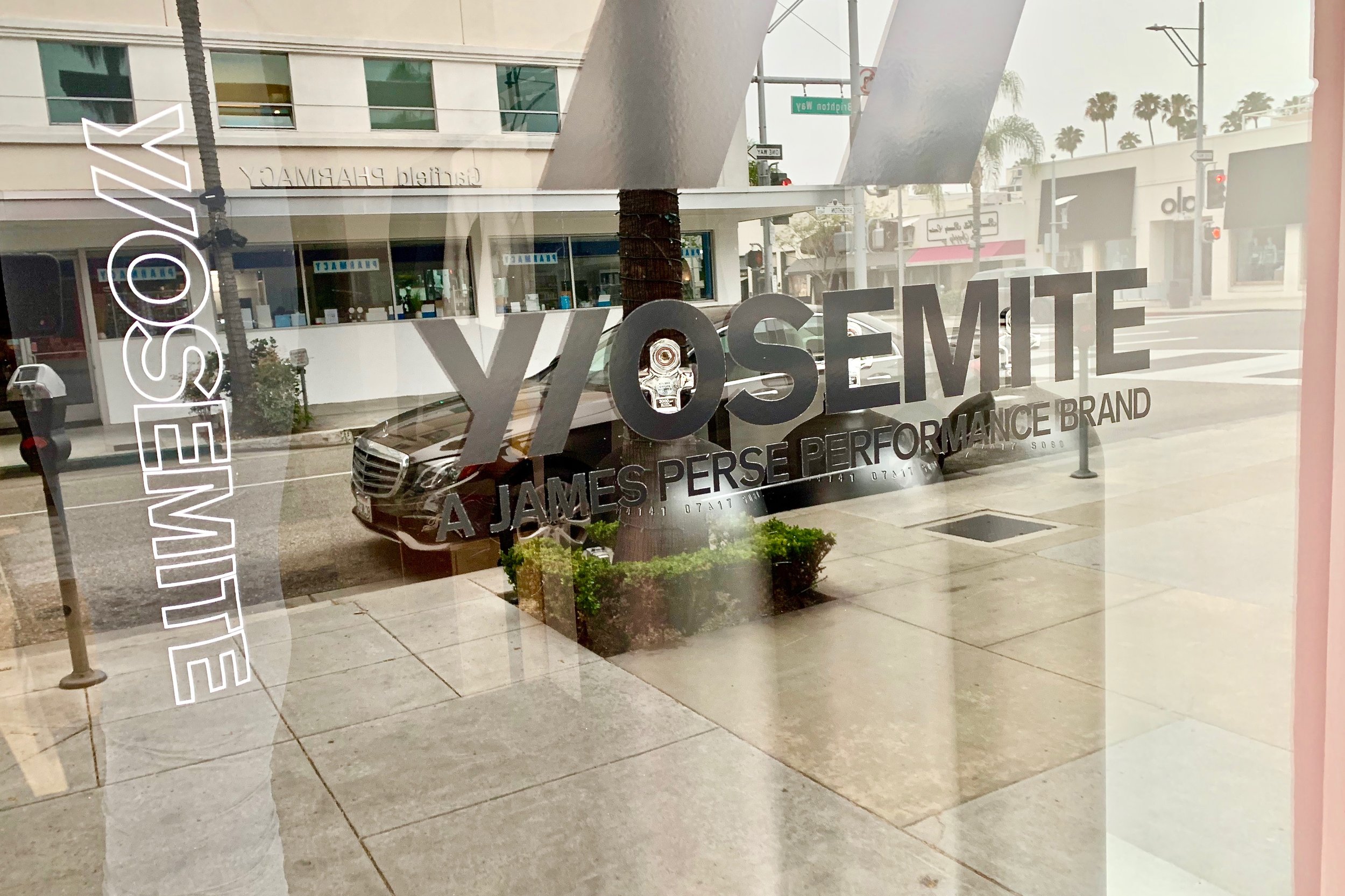
It was hard to read what to expect within.  Pictured below is the answer to what Y/OSEMITE is selling.

Y/OSEMITE

JAMES PERSE PERFORMANCE BRAND

Jame Perse's new performance brand is what is being sold in this store.  Or simply put this is another name for a luxury athletic clothing brand!  We solved one mystery!  And if we were not students of brands, we would have simply moved on and not given a hoot about this store.  

We knew we would be leaving Beverly Hills before the store would open, so we checked out the website.  The clothing was nice comparable to Lululemon, and AloYoga in pricing.

When it comes to clothing, we both prefer window shopping, rather than walking into the dark unknown.  Although we both are fond of the mystery genre when it comes to books and movies, this approach left us cold.  We still don't know why Yosemite was chosen as a name.  And why was the letter Y separated with a forward slash from the rest of the word?   For us, this was definitely lost in translation in Beverly Hills!

Branding Moments: Is Your Message Lost In Translation?

When it comes to branding and marketing strategy in luxury real estate, or any other real estate niche, we have always preached that your brand has to be so clearly defined that it is easy to understand and remembered by anyone in your marketplace. This fundamental aspect of branding applies, even if your potential buyers/sellers are not at the moment interested in buying or selling a home.  Branding done right needs no explanation, let alone translation.

Pictured above is a business advertisement we spotted while strolling in the small wine producing village of Gevrey-Chambertin in France (population 3084 in 2015).  There is no need to translate what this business does, and who they cater to.  

Is Your Message Lost In Translation?

Branding Moments: Are Kangaroos Cuter Than Boars?

One of the rules of brand strategy in any business especially real estate is to speak the language of your  target market.  In order to that, research comes into play.  Research takes time, and discussion in order to decide on an approach.  This leads to a branding strategy which includes a graphic, a name, a reason to exist, and be of value in the marketplace.

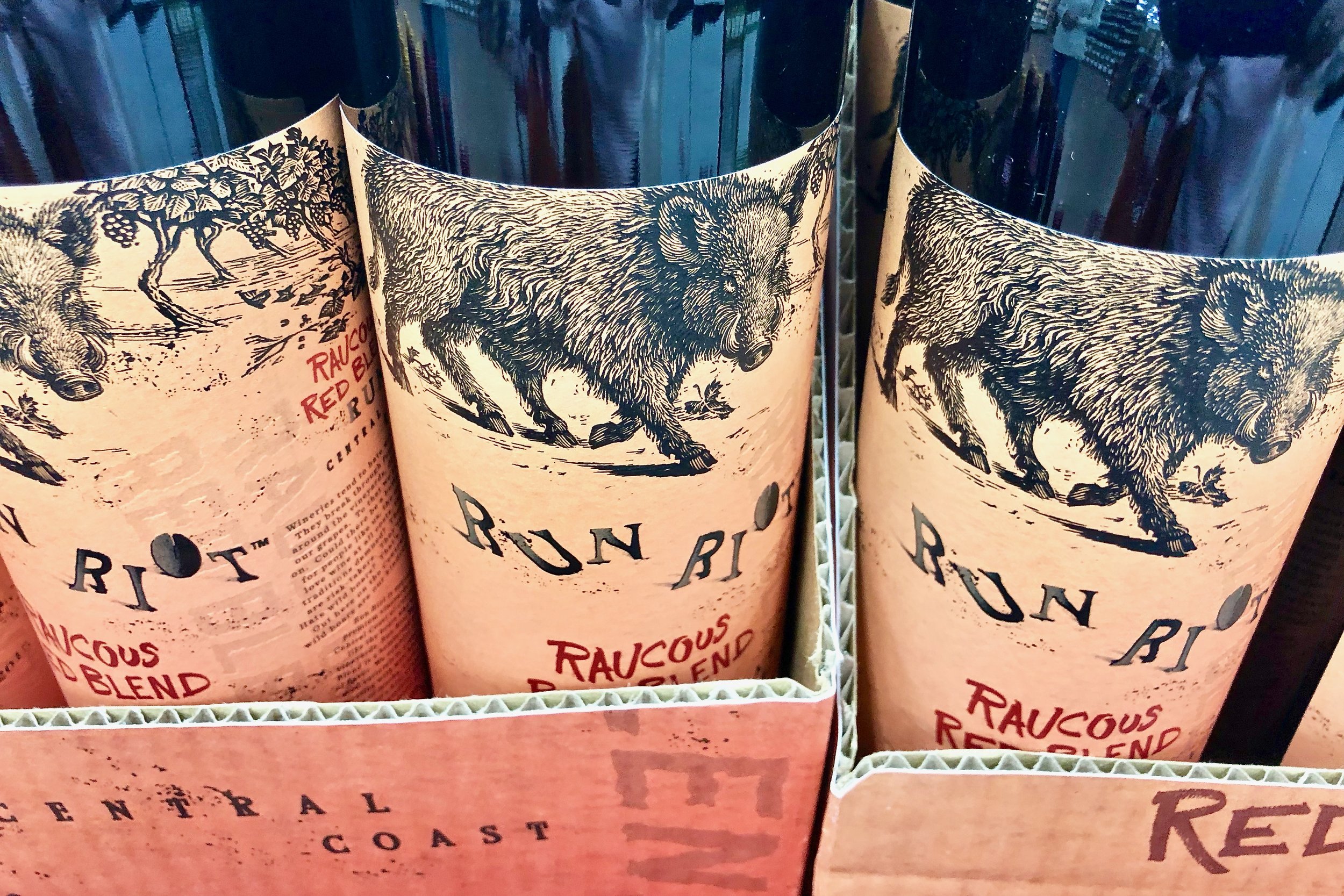
We spotted this brand of wine at Trader Joe's recently.  The etching of the boar on the label is beautiful done.  This is a red blend from the Central Coast called Raucous Red Blend.  The winery is called RunRiotWine.  Their slogan is "no rules when wine rules".  Their claim to fame is that unlike other wineries, they don't chase the boars way who roam in their vineyard.  It was initially priced between $22 to $18.  

Our knowledgeable wine friend told us, this wine is very, jammy, fruit forward, not for you.  The reviews were mostly favorable: not a very high rating and not a very low rating.  It is evident they were going for that Kangaroo wine Label (Yellow Tail) market.  This market is for those who just want a good inexpensive wine worrying about the finer points of wine making.  

Judging by the "new" price, it is evidently the brand did not attract their target market...Perhaps Kangaroos are cuter than boars to those folks. What do you think?

Advertising Is Becoming Theater-Are You Buying Tickets?

Advertising as Theater: Eye-Catching Videos on Rodeo Drive in Beverly Hills

In marketing luxury real estate the competition for attention is fierce. All global luxury businesses are facing the same phenomenon: the shrinking attention span of customers. That is why it is more important than ever to pay attention to your personal and company branding, your own packaging and the way you package listings, How can you expect to hold the attention of your target market if you do not capture it in the first place?

The media of streaming video has become mainstream. Digital video advertising has just overtaken traditional advertising. (TV, radio, print)) in revenue.

Paying attention to the hits and misses of how the global luxury brands incorporate video in their storefronts on Rodeo Drive and other high end retail streets around the world can offer some clues. Take a look at this video below. It shows some eye-catching use of videos. But, is it drawing customers into the stores? That is the big question. Advertising is becoming theater. Are you buying tickets?

Luxury Real Estate Marketing Essentials: The Win/Win of Snail Mail Care!

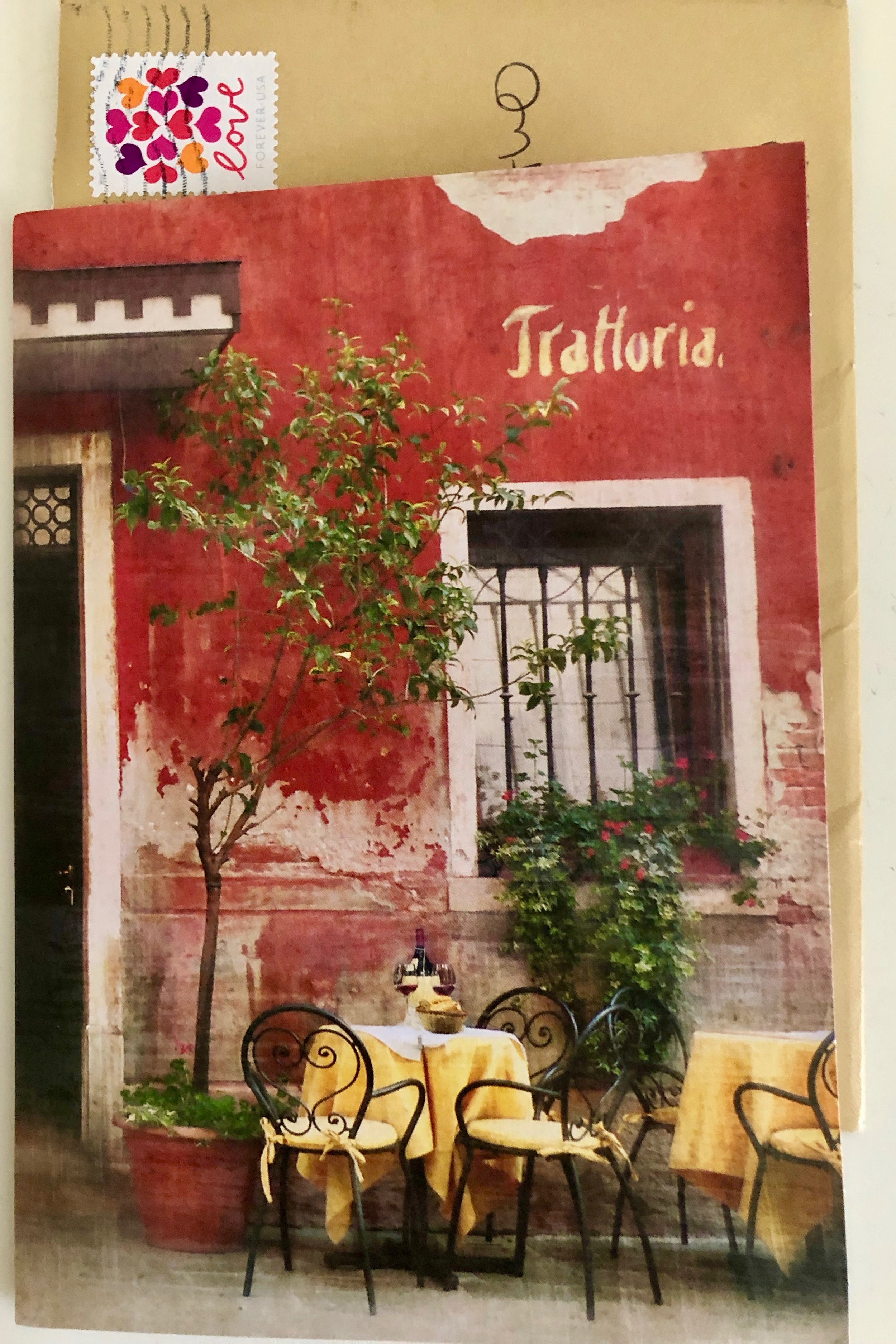
Every so often, it is very nice to receive snail mail.  Pictured above is a photo of a card I received over the weekend.  This is someone, I (A) do business with, because she is outstanding and incredibly thoughtful.   A couple of years ago, she moved from Northern California to Texas.  Thanks to the Internet, I can still order merchandise from her. 

Every so often she sends me a special card thanking me for the business I give her.  She knows I like to travel and Italy is one of my favorite countries to visit.  This card depicts a type of scene I treasure and look forward to when we travel to Italy.  This is a perfect way to stay in touch and show snail mail care!

Can you feel the love and care?

Branding Moments: Does This Brand Have an It-Factor ???

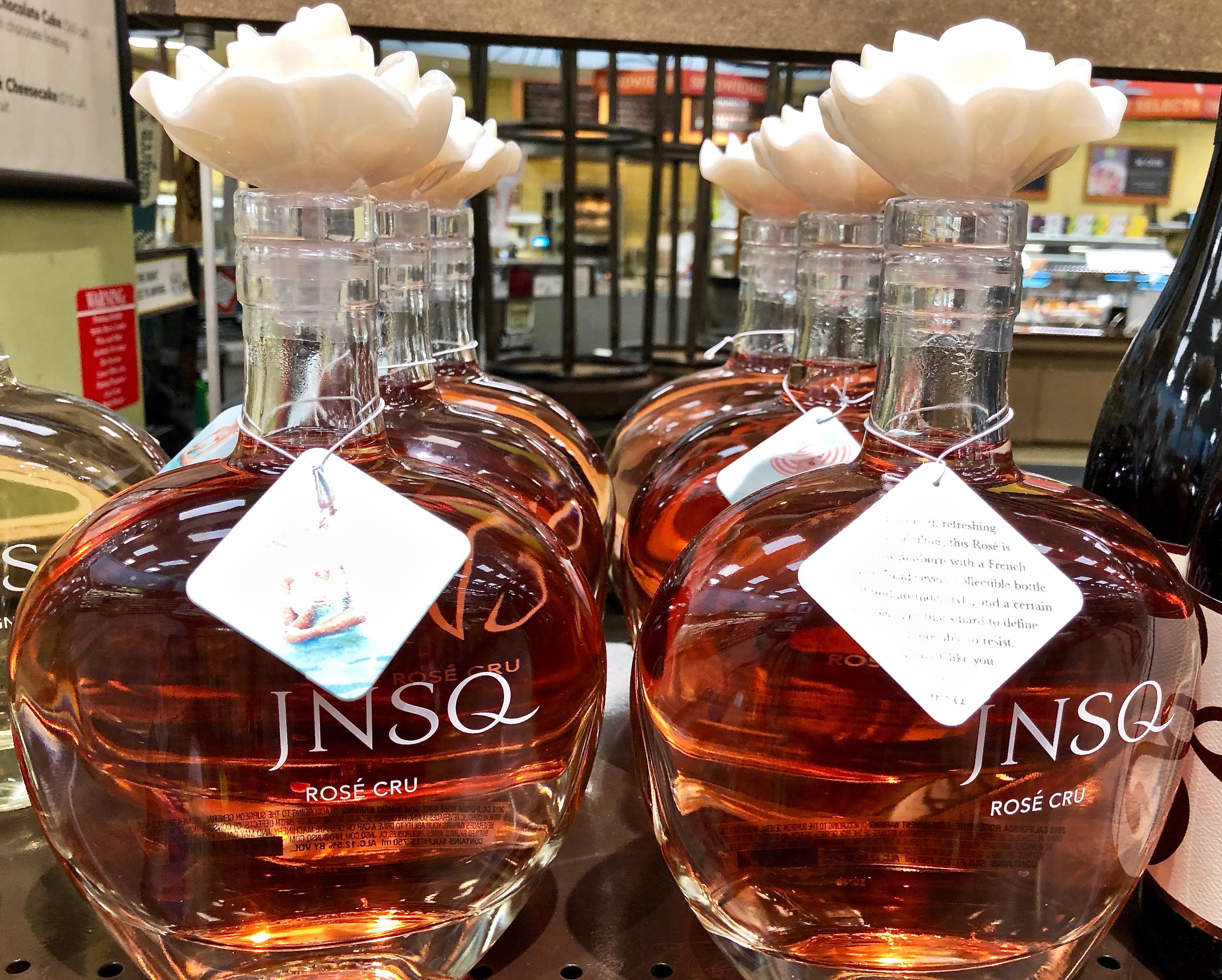
Last week we wrote a post discussing the “it Factor” . Today, as I was perusing the wines at Whole Foods, I was drawn to take another look at this bottle.  The brand name is J N S Q. This brand represents the first letter of theFrench phrase for the It-Factor, "Je Ne Sais Quoi."

In researching this wine, I was amused by the press release for it, and I quote:

"Introducing the first rosébrand created for millennial women that doesn’t talk over them, or down to them. JNSQRoséCruis an easy-to-enjoy luxury wine created in the classic French style and crafted from premium California grapes, giving it both a timeless elegance and a modern attitude. This unprecedented approach to winemaking– and the name gracing the beautifully curvaceous bottle – were inspired by today’s young women setting the world on fire on their own terms, with a certain jenesaisquoithat’s hard to describe but undeniably irresistible."

“Millennial women and older Gen Z’ers are bringing back an appreciation for quality, craftsmanship and functional beauty,” said Lynda Resnick, vice chair and co-owner of The Wonderful Company. “JNSQwas created specifically for these women and the milestones they are celebrating in their blossoming and exhilarating lives. It’s a wine made with that same shared quality of jenesaisquoithat makes each of these ladies unique, memorable and unstoppable.” 

It is priced at $29.00.

If you have followed our blog, you know that both Ron and I enjoy wine.  I cannot recall one instance, when someone (male or female) has talked down to me, either in a wine store locally, worldwide or at any winery  I have visited. 

Before reading this press release, I was very sure that wine was a non-gender libation.  I enjoy drinking wine with my husband, and my friends of all legal drinking ages, genders, denominations and political affiliations. The concept of a his/hers wine would never enter my mind!

When I read this post to Ron, his response was that he felt this was an insult (perhaps unintended) to women in general of all ages, women wine makers, sommeliers, growers and all the women who are involved in the wine industry.  And I agree. 

What is your opinion?