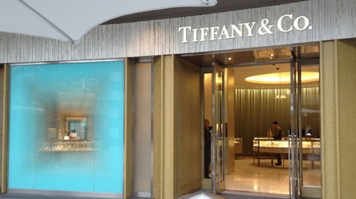
We love visiting the Westside of Los Angeles, where we used to live. As part of our design study, we decided to visit the newly refurbished Santa Monica Mall. The mall was transformed from an indoor facility to an outdoor facility which was a successful architectural feet. The result is elegant, uncluttered and very pleasant to walk around in..
When we saw the Tiffany store, we were inspired by the uncluttered presentation featuring a jewelry vignette in one of the windows. The other side of the store had the identical look with a different jewelry vignette. The overall feeling is balanced, inviting and attracting the customer to come in and shop. The brand colors of Tiffany blue and silver are represented beautifully.
Like a store, a website has to attract the customer to stay and shop, If the store or web site is unappealing, you walk away or click on to the next store or web site.
- WATCH VIDEOS-
Buzz-Worthy Luxury Real Estate Websites
Personal Branding Case Studies Company Branding Case Studies
- JOIN THE LOL COMMUNTIY -
GET FLUENT. GET AFFLUENT!
Linked In, Facebook, Active Rain
Follow Us on Twitter: LuxuryMarketing
