As part of our brand strategy services, we design websites to be consistent with the brand and for curb appeal, we do not develop them. In other words our concern is with the aesthetics of a site and not the codes needed to make it work.
As part of our brand strategy services, we design websites to be consistent with the brand and for curb appeal, we do not develop them. In other words our concern is with the aesthetics of a site and not the codes needed to make it work.
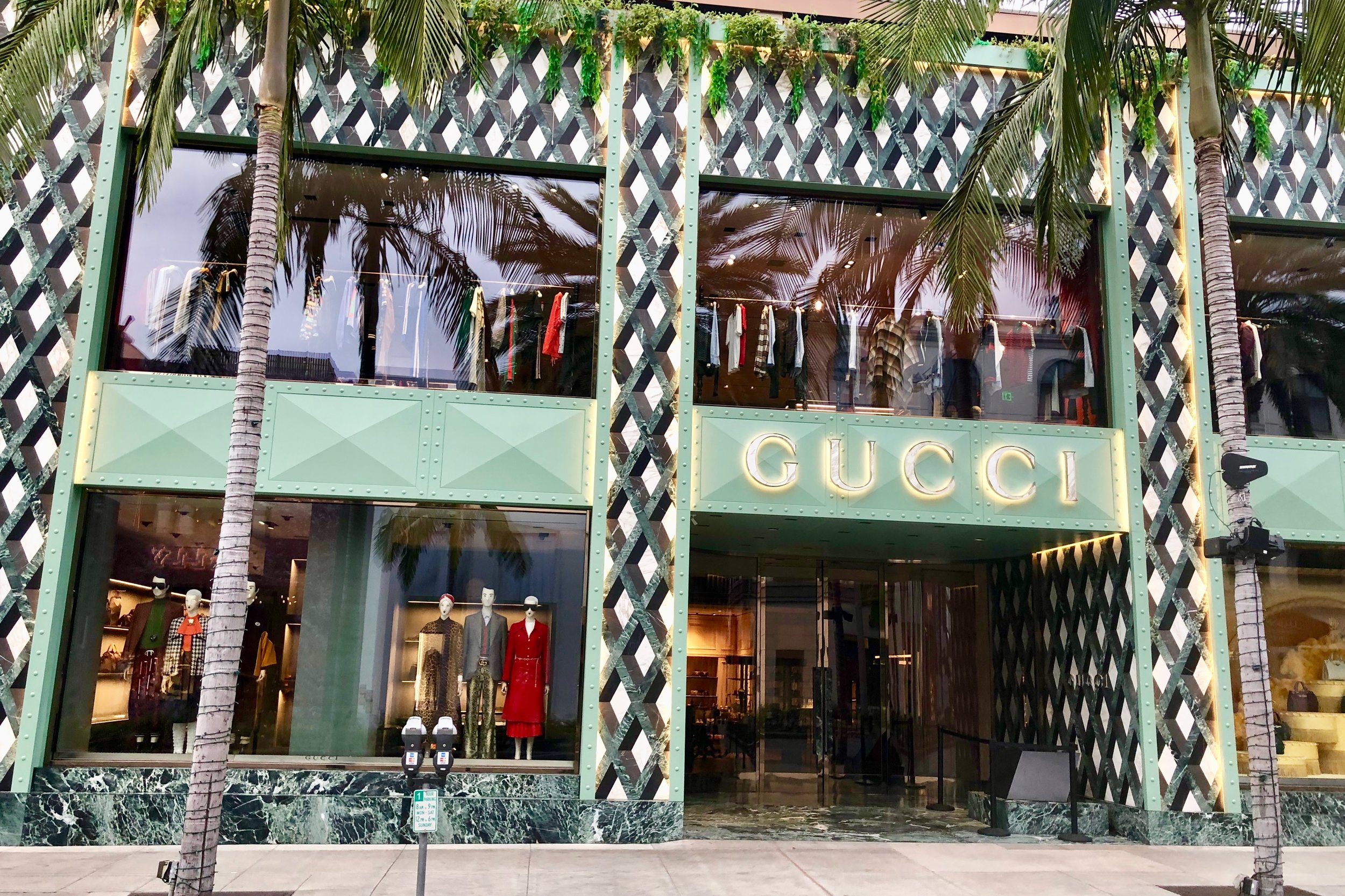
This past Tuesday morning, we took time to walk along Beverly Hills famed Rodeo drive to study the latest remodel revealed of the flagship Gucci store (pictured above) which began in May of 2018.
We focused on studying the design. The extensive use of marble combined with a green metal for the brand name and support emphasized the longevity of this luxury brand (founded in1921, in Florence) as well as it new progressive era combining it with metal as part of the design.
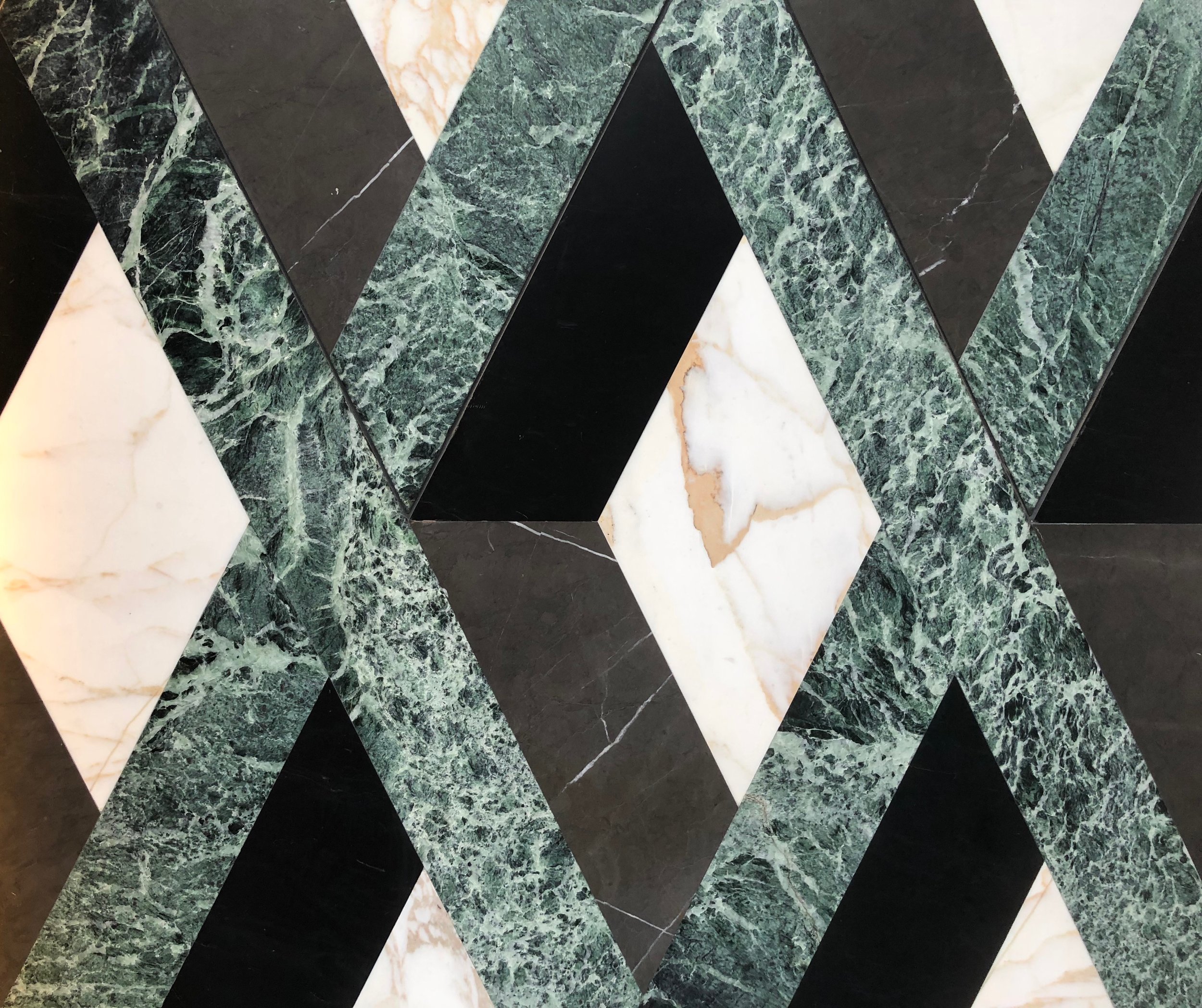
The marble is cut in pieces in "trompe l'oeil," style, and precisely placed in a geometric pattern to create the 3D illusion. This translates from French as optical illusion or something that fools the eye. To the touch the surface is flat.
The entry way to the store is a curved wall of trompe l'oeil inviting you into the store. The other side of the entry is a curved glass wall giving you a peek of their merchandise. It gives the shopper a feeling that there is more than meets the eye, a sense of surprise and excitement, wanting to see more, (pictured below).
Does your website have curb appeal?


