As a luxury or any category of real estate marketing professional, one of the best ways to think of your real estate web design is to study the window dressing of fine retail establishments. A luxury retail store is designed to attract its customers and maximize sales.
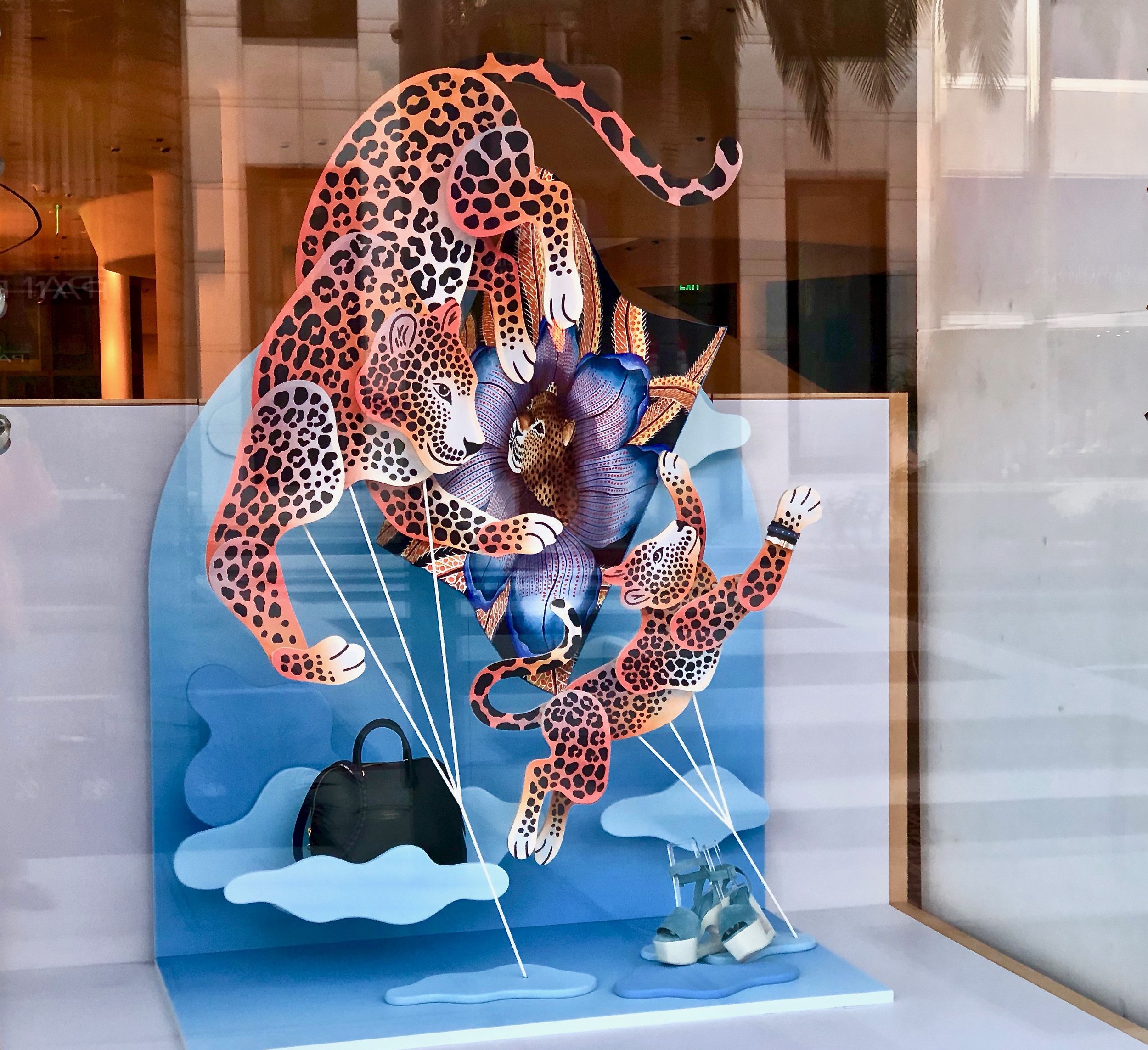
Pictured above is one of the Hermes windows displays in Beverly Hills. The theme is planning summer vacations suggesting a tropical destination. Only two items are displayed: comfortable shoes and a large bag for those last-minute items. There is no clutter, no extraneous items which adds to the power of attraction.
Here are some guidelines to consider that are applicable to web design:
The store front usually has a huge window display. The idea is to let customers see the merchandise within the store, as well as a special vignette of the latest merchandise. On the web site this should be your home page. Is it appealing to look at? Does it have curb appeal? As part of the home page, several iconic images of the area in which you work may be appropriate.
Is the merchandise aesthetically pleasing? When looking at what you are displaying, i.e. your listings, how do they look on the page? Are the initial photos inviting the potential client to click further and find out more? Is there logic to the way they are displayed?
When you are in the store are the colors complimenting the displays? Is the site easy to read? Often black is overused as a luxury color particularly with white lettering. If the whole site is black with white writing, it is hard to read. It may be beautiful from a design standpoint, but difficult on the eyes. Is the type large enough? Functionality is more important than the look. The purpose of the site is to attract clients, not to win awards.
Is it easy to access the inventory? Is the search function easy to use on your site? If the client has to fill out a lengthy form to find information, they will click away. There are plenty of sites on the World Wide Web that can be searched by remaining anonymous. Is it easy to access you?
A luxury store avoids clutter and anything that may detract from focusing on the merchandise for sale. Avoid all extraneous information. Accessorize with pertinent and insightful information about your marketplace such as the nature of your community and why it is special.
In conclusion, think in terms of attracting the customer with eye candy. Keep them interested in your listings. And do not forget to refresh the site with new photos and new displays of your listings and community.

