Using color effectively in luxury real estate branding can help to make you stand out from the crowd. Your brand colors can speak volumes about who you are and how you are distinct from your competition. In this article series we delve into some of the nuances of brand colors and how to integrate them into your brand story.
Some people love the hot or warm colors: red, orange, yellow, magenta and gold. Others prefer cold or cool colors: blues, greens, white, grays silver.
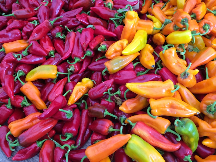
This image of sweet peppers, taken at the Santa Barbara Farmer’s Market, focuses upon hot colors. But, notice that there are several cool colors that offset the hot colors. This contrast makes it easier on the eyes to view an image for a longer period of time.
If your luxury real estate brand colors are going to include both hot and cold colors, one of the important principals to keep in mind is using the right proportions of hot and cold colors.
The color swatches below are actually samples of hot and cold colors taken from the same image of the peppers. Can you see how important proportion of hot and cold colors are to a composition?
Written by Ron & Alexandra Seigel-
ABOUT: Napa Consultants, International is the leader in brand strategy for the luxury real estate industry. They work exclusively with professionals who are passionate about gaining or sustaining market leadership. With an expertise in personal branding, company branding, luxury real estate website design and social media marketing they help their clients become the breakaway brand in their marketplace.
-WATCH VIDEOS-
Buzz-Worthy Luxury Real Estate Websites
Personal Branding Case Studies Company Branding Case Studies
GET FLUENT. GET AFFLUENT! - JOIN THE LOL COMMUNITY


