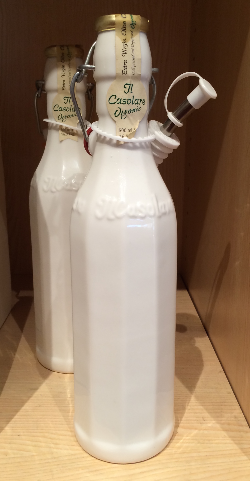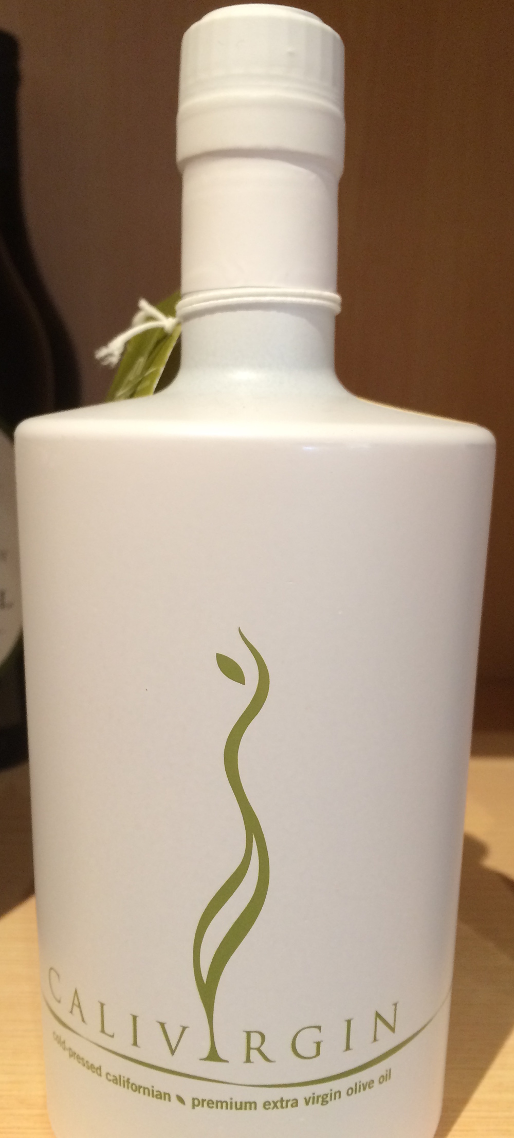
Recently we noticed two examples of extra virgin olive oil brands that are packaged in opaque white instead of the usual clear tinted bottles. Although they stood out, the only connection we could make for the use of the color white is its association with the word, virgin, or the symbolism of a white wedding dress. Oddly, we were not inclined to buy either brand, because we are conditioned to purchase olive oil in see-through bottles.

Could this be a new trend? Many national and international brands are re-packaging their websites and products using white as their dominant brand color. Here are the reasons people are attracted to the color white.
The human eye interprets white as a bright color, which is why white is a good contrast color, and not a neutral. Symbolically it expresses purity, simplicity, lightness, delicacy, minimalism, and sophistication.
In the case of olive oil brand packaging, do you think this is taking this trend too far? Or, would you be tempted to try either of these brands because of the unique packaging?
Written by Ron & Alexandra Seigel-
ABOUT: Napa Consultants, International is the leader in brand strategy for the luxury real estate industry. They work exclusively with professionals who are passionate about gaining or sustaining market leadership. With an expertise in personal branding, company branding, luxury real estate website design and social media marketing they help their clients become the breakaway brand in their marketplace.
-WATCH VIDEOS-
Buzz-Worthy Luxury Real Estate Websites
Personal Branding Case Studies Company Branding Case Studies
GET FLUENT. GET AFFLUENT! - JOIN THE LOL COMMUNITY
