The proportions and combinations of colors used in your luxury real estate personal or company branding is an important aspect of communicating your marketing message. Certain colors have strong emotional connotations and also cultural bias that can work for or against your brand.
For example, red, white and blue can stir the deep emotions of patriotism. Several regional and national American real estate brands have used this color combination to their advantage.
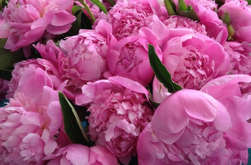
This color palette was sampled from the photograph of the peonies above. When you think of the color pink what associations come up in your mind?

Various shades of pink can be used in personal and company branding to communicate a range of thoughts and feelings from subtle to bold. Mary Kay Cosmetics, known for their pink Cadillac rewards to sales people, has shifted their brand to a more sophisticated feel by making black and white the dominant colors of their brand with a pale pink as the accent.
T-Mobile has used shocking pink as an accent to black, charcoal gray and white. Whereas, world-renowned Fauchon, purveyors of fine gourmet foods in Paris, unabashedly uses pink as their primary brand color with black and white as the accent.
Pink is a color that has long been associated with the female sex. Today, more men choose to boldly embrace pink and ignore this cultural bias.
The famous British traditional shirt maker, Thomas Pink (80 stores worldwide) is part of the Louis Vuitton Moet Hennessy group. Pink’s luxury brand color scheme incorporates black, white and gold with pink as the accent. Their mascot is the “Cheeky Fox” and their brand story is quite interesting. Mr. Pink was the 18th century tailor who invented the iconic scarlet red hunting coat. But, it was referred to as PINK in honor of its originator.
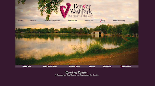
 One of our clients, Courtney Ranson, specializes in the Washington Park area of central Denver, Colorado, also known as “Wash Park”. Her ultimate favorite color is fuchsia, a very strong pink. We used this color deliberately as an accent (with deep plum as the dominant brand color), to communicate her passion for her beloved neighborhood and also to romanticize the area. Her slogan (incorporated in her logo) is Denver Wash Park -“ The Heart of the City”. Watch this Video Case Study.

Colors plays a big role in luxury real estate personal and company branding. Your personal color preferences need to be balanced with what is appropriate within your marketplace and also what makes your brand stand out from your competitors’.
-WATCH VIDEOS-
Buzz-Worthy Luxury Real Estate Websites
Personal Branding Case Studies Company Branding Case Studies
- JOIN THE LOL COMMUNTIY -
GET FLUENT. GET AFFLUENT!
Linked In, Facebook, Active Rain
Follow Us on Twitter: LuxuryMarketing
